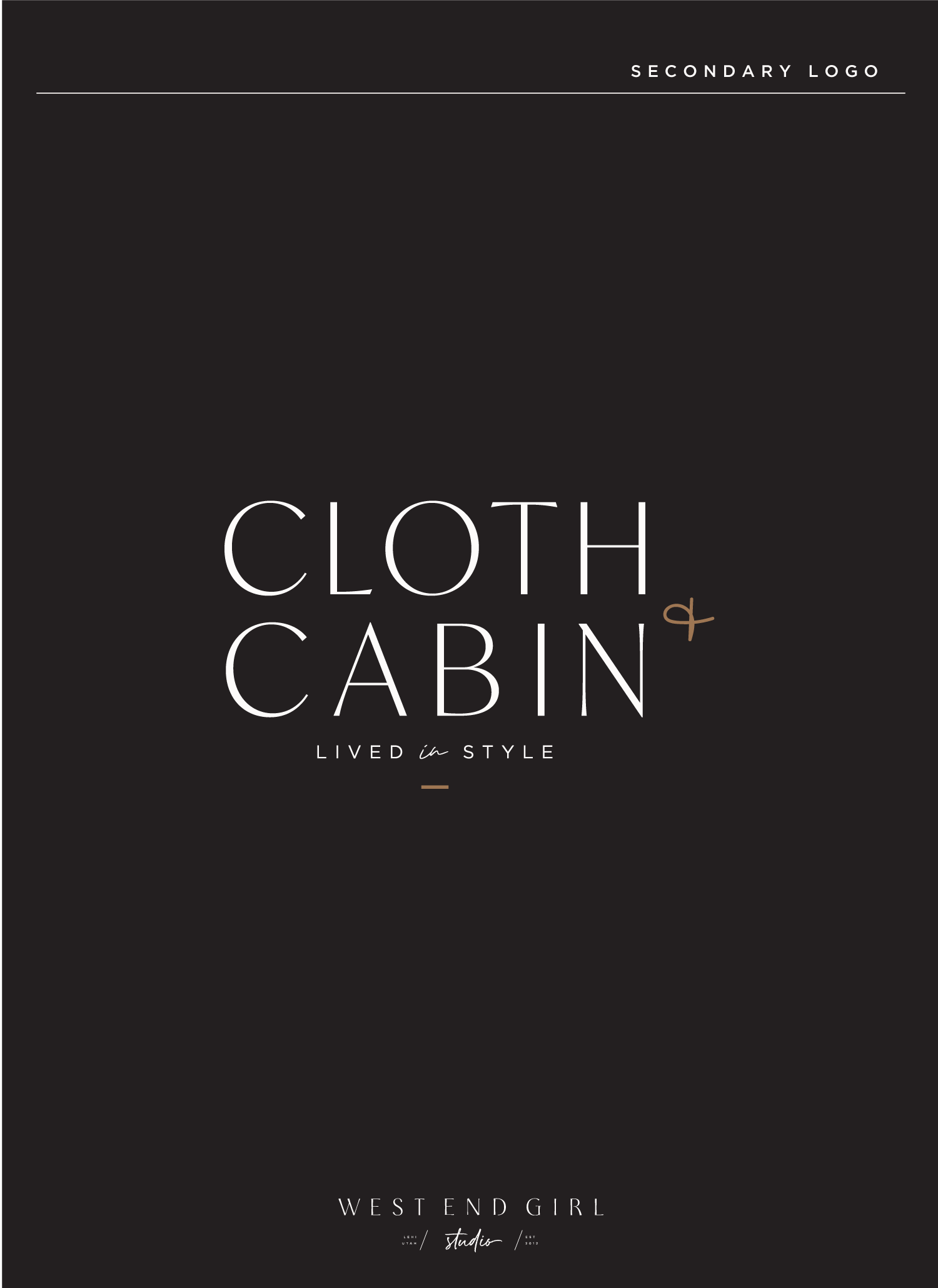
I want a cosy classic logo I loved working on this project for Cloth and Cabin owner Amy. She has such a great home decor and clothing boutique that I really wanted to design something that would enhance her already thriving business. We came up with a strong neutral palette with a pop of caramel…
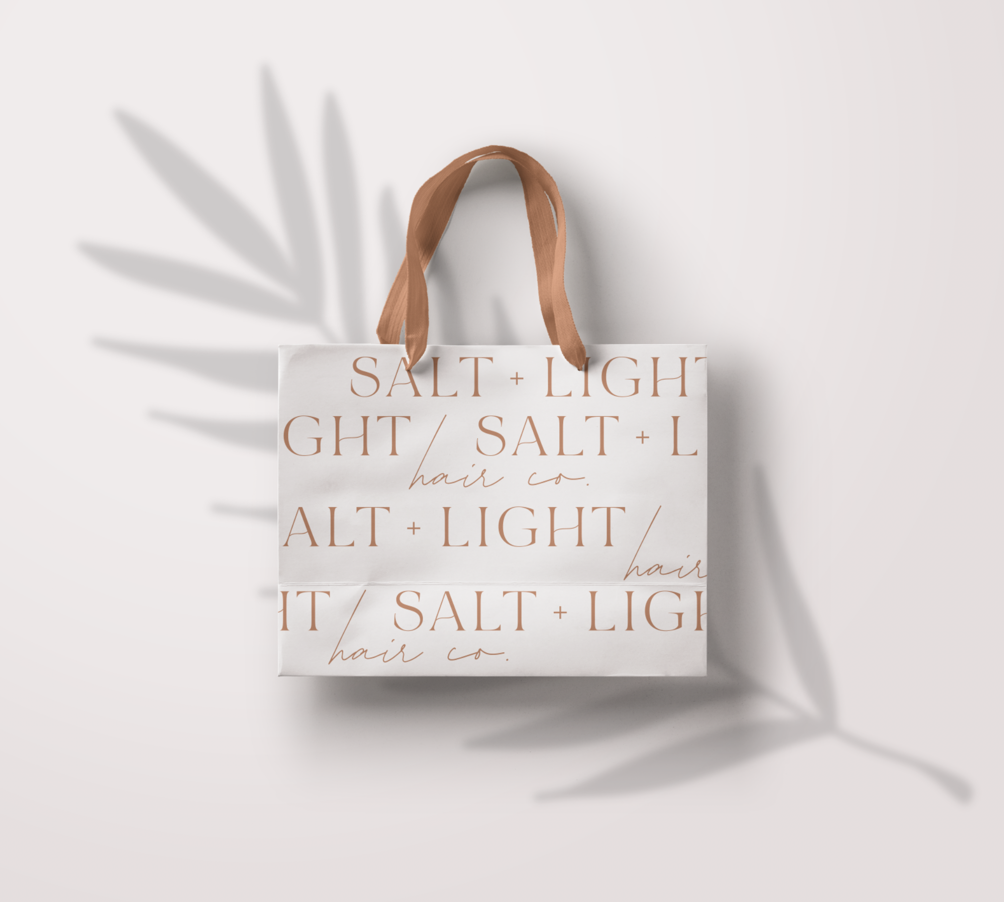
Some other fun options I came up with that didn’t quite make the cut but I still loved them! Branding for Salt and Light hair was so much fun because it was in allignment with my own style right now. When a client and a designer are a perfect match magic happens and everything about…
This interior design firm was a dream to work with. They wanted an organic desert styled color palette was so fun to come up with. We chose rusts and nudes for our summer and overal palette and then added in some cool dusty blues for a winter palette. But all of these colors work so…
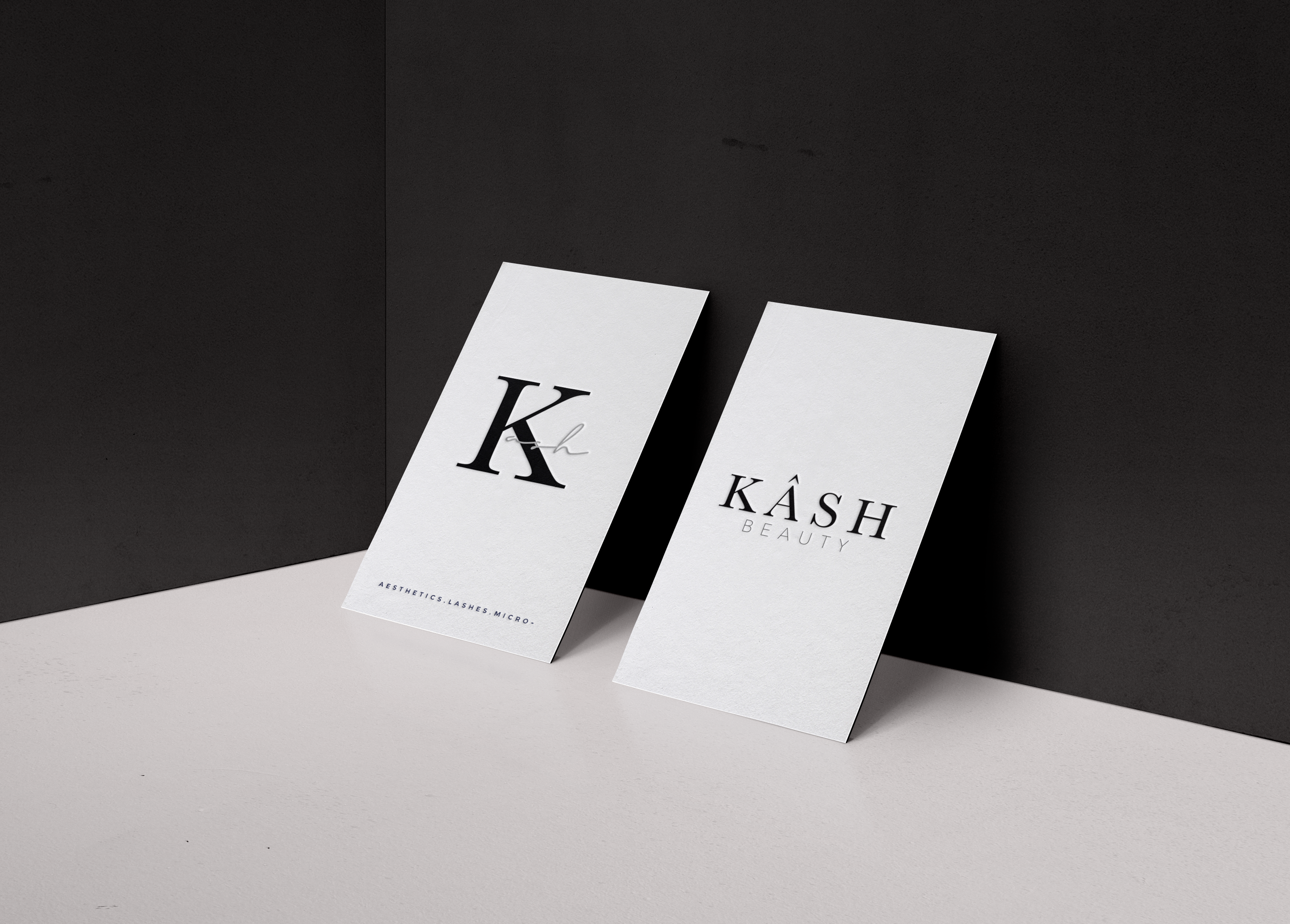
This project was for a beauty brand created by an amazing esthetician. She wanted something that resembeled a makeup label with the simplicity of a minimal color palette. I think overall it turned out exactly right for her brand. When doing makeup inspired branding, I think using the color black is very important. It gives…
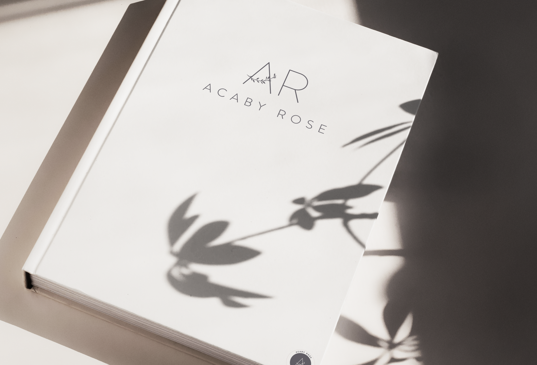
I had the chance to work on a couple family projects this year and Acaby Rose was one of them. It is a womens clothing line that has had so much time and care put into its products. I am really excited to see the final product. They requested a really simple, clean font style…
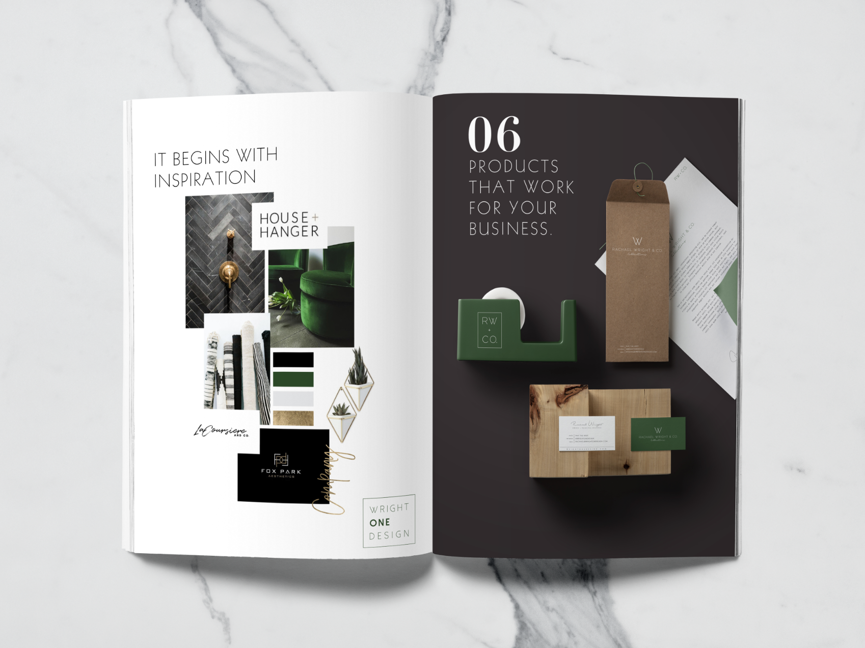
I love doing sister companies because I get to design an all encompasing vision of what could become a huge intuitive brand. Wright One Design is an interior design firm on the rise with great style and a fun modern twist to everything. Her product company, Rachael Wright and Co. is where her designer collection…
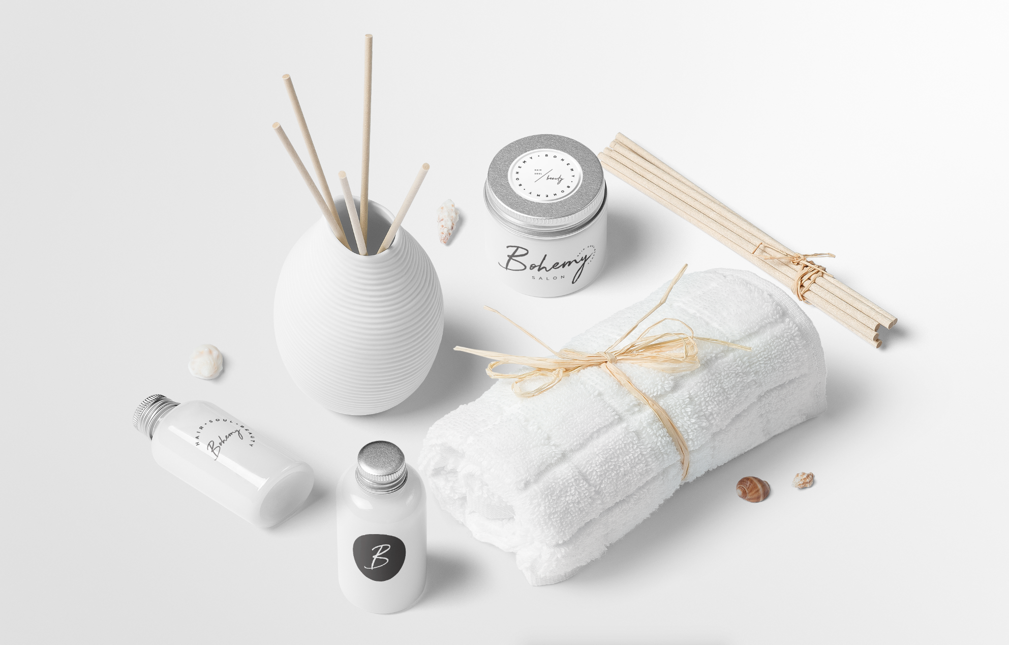
Bohemy is a beachy bohemian styled salon with a fun edge located in Florida. The client wanted a really modern but relaxed feel to the overall branding keeping it simple with the color palette only adding pops of mint and dusty blue. I love what we ended up with and I think it was…
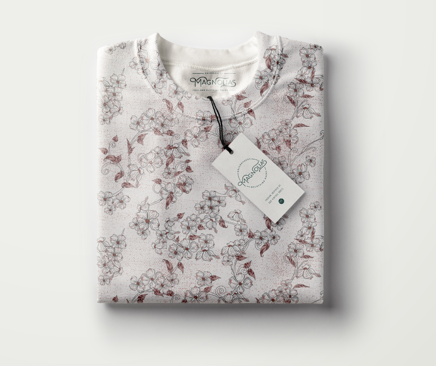
This post literally could go on forever. I LOVED doing this project because it was vintage and the color palette was so fun. Doing vintage allowed me to try lots of unique fonts and color mixtures with the added bonus of an aged texture. The client ended up with the custom lettering in a circle…
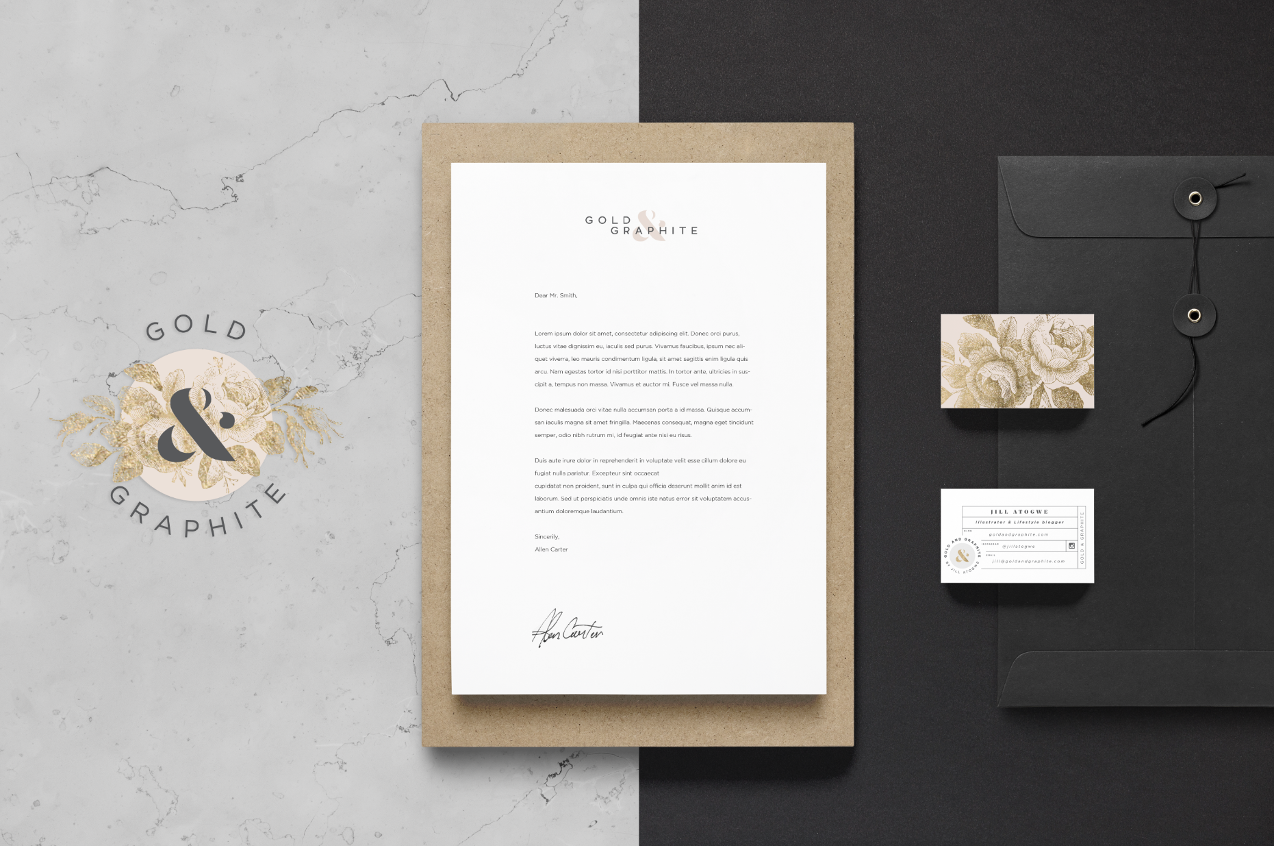
I love to put the logo options in my post because its so fun to see how the logo evolves as well as the different directions someone can go with the same overall idea. This project was so much fun to work on. I was inspired by Jill and her amazing blog and saw the…
