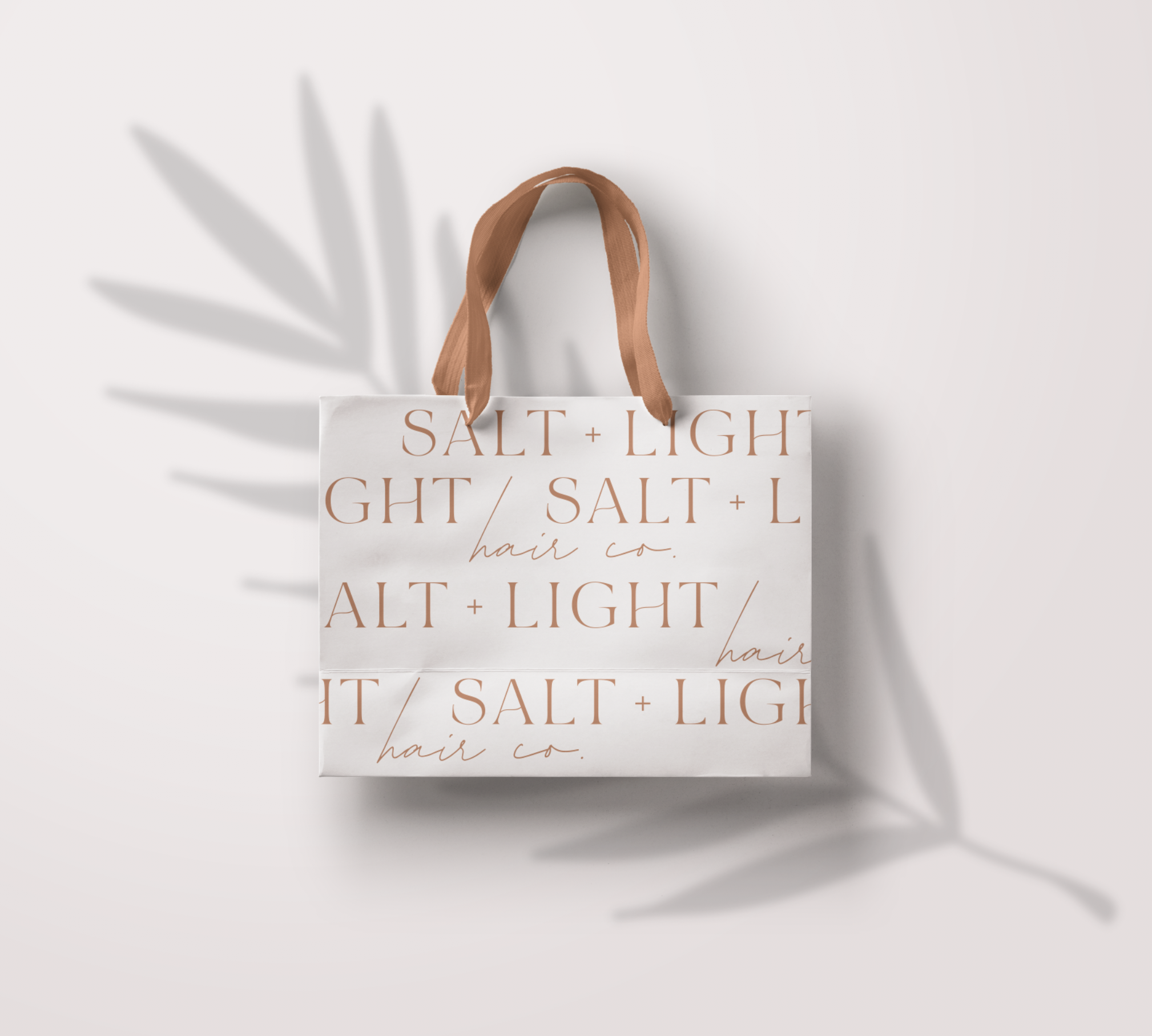
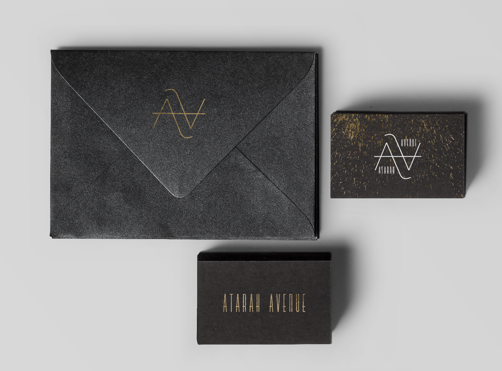
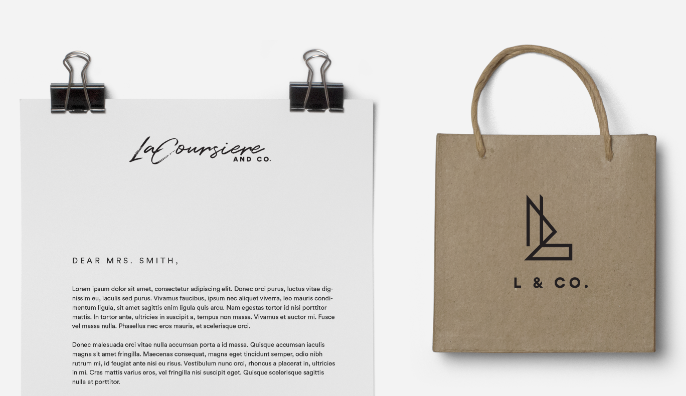
Some other fun options I came up with that didn’t quite make the cut but I still loved them! Branding for Salt and Light hair was so much fun because it was in allignment with my own style right now. When a client and a designer are a perfect match magic happens and everything about…
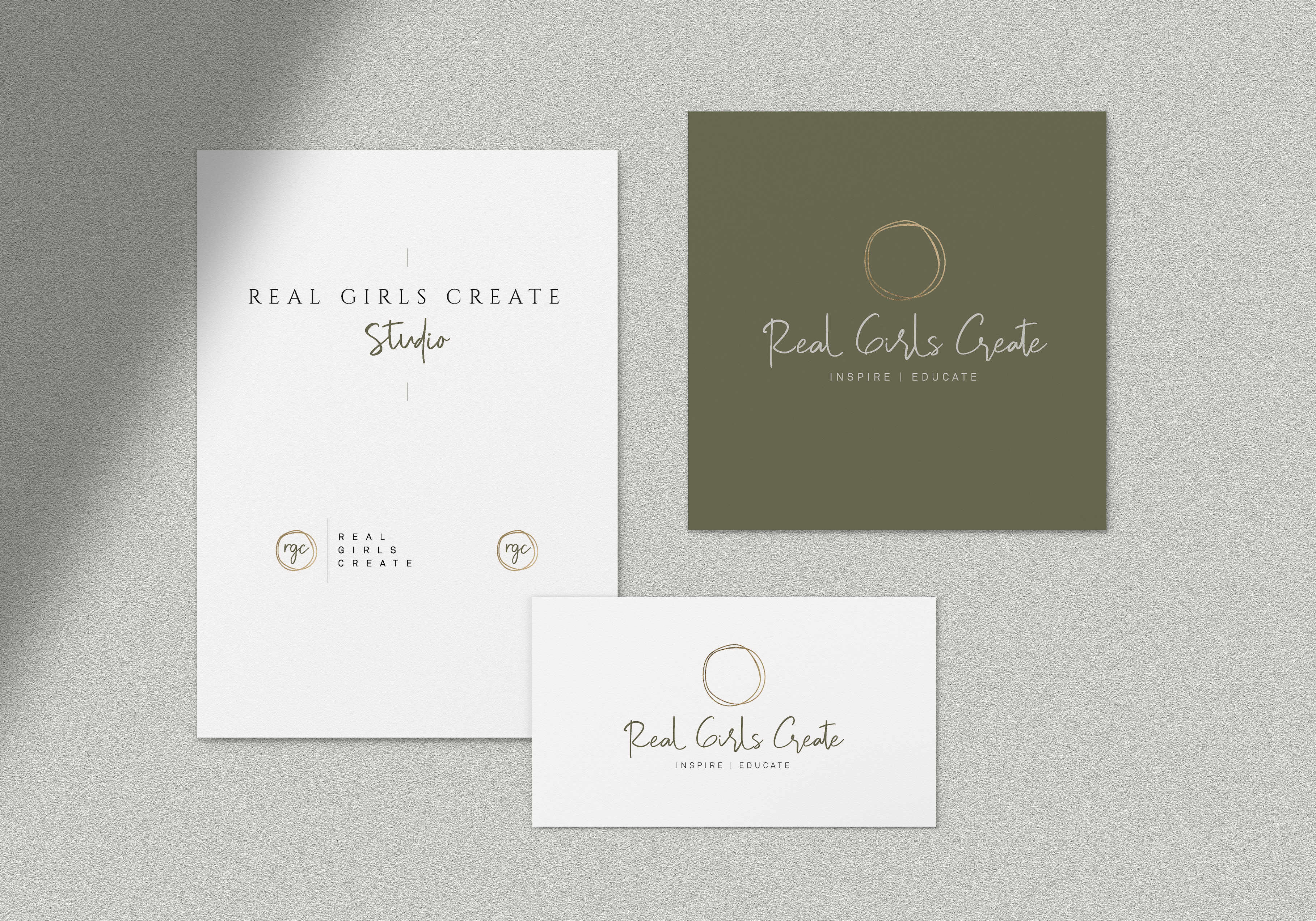
This branding was such a fun experience for me because I got to be really creative and use a color palette I don’t get to use often. The olive green was such a pretty touch to this inspirational brand. We did two logos that went well together for each sister company and then two accompanying…
Hi! So ya I’ve been out for a while but I am ready to post a bunch of my recent projects. This one was for an amazing jewelry company based in Europe who is launching soon! Woohoo! We ended up doing a bunch of variations until we ended up with this one and I love…
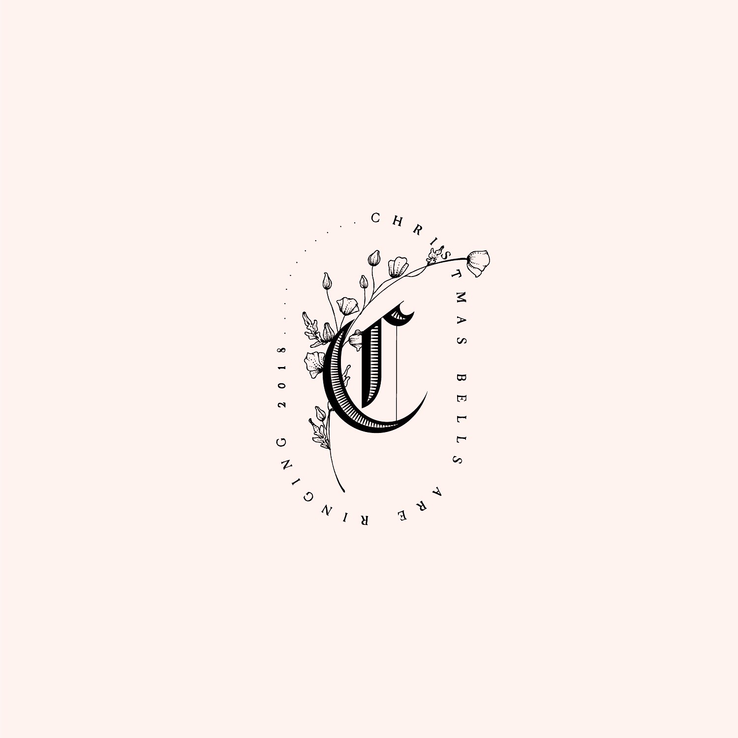
This one ended up looking Harry Potterish but I’m not going to complain. Here is the logo mock-up I did to show how these fonts can be used. I always like giving myself a new challenge, and this one was no different. I have always loved the intricate details of medieval inspired fonts but…
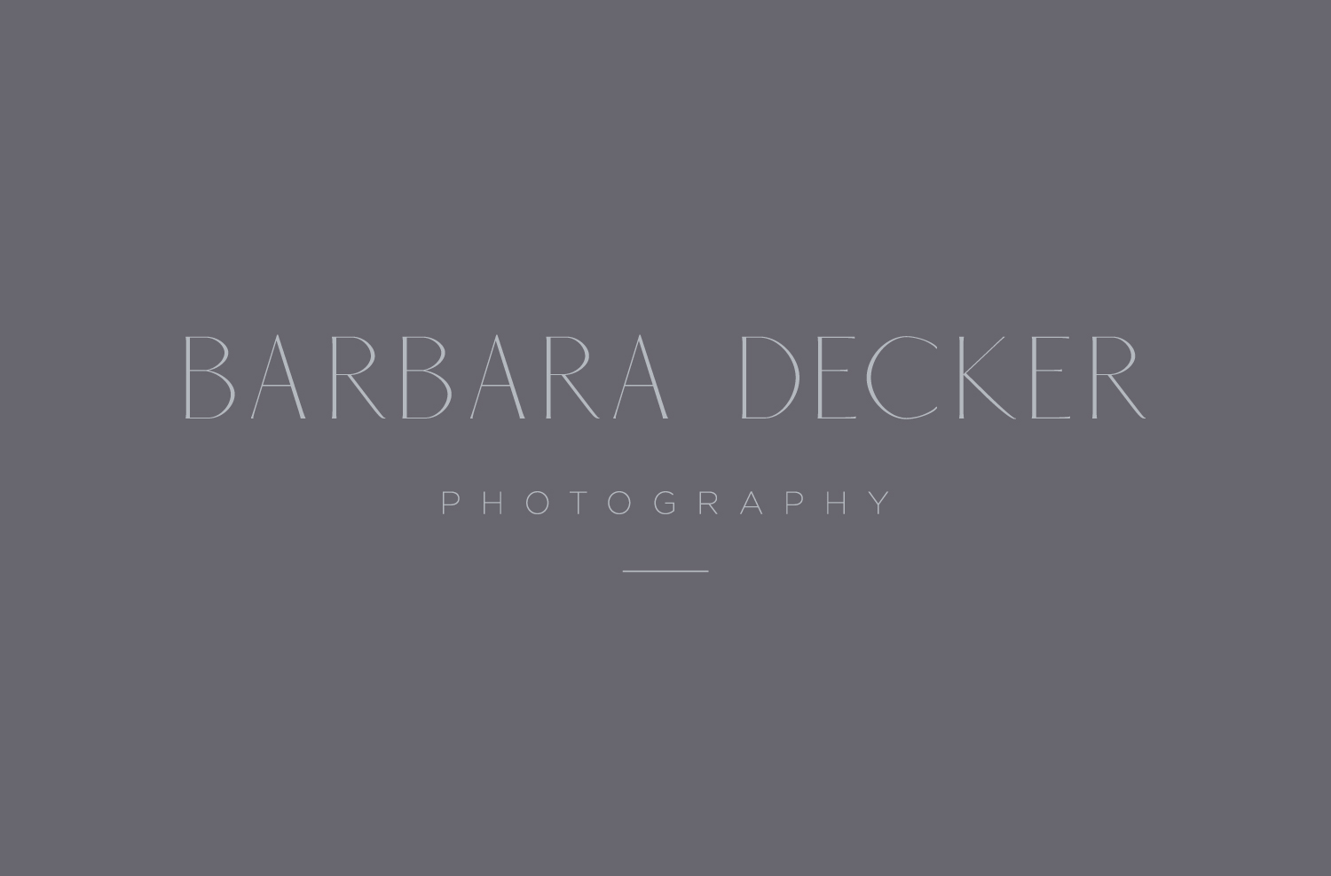
Barbie Decker is a good friend of mine with loads of talent. She specializes in home decor and food photography which are two of my passions. I was so happy when she reached out to me to do her branding. She loves natural colors with simple modern text and I think we came up with…
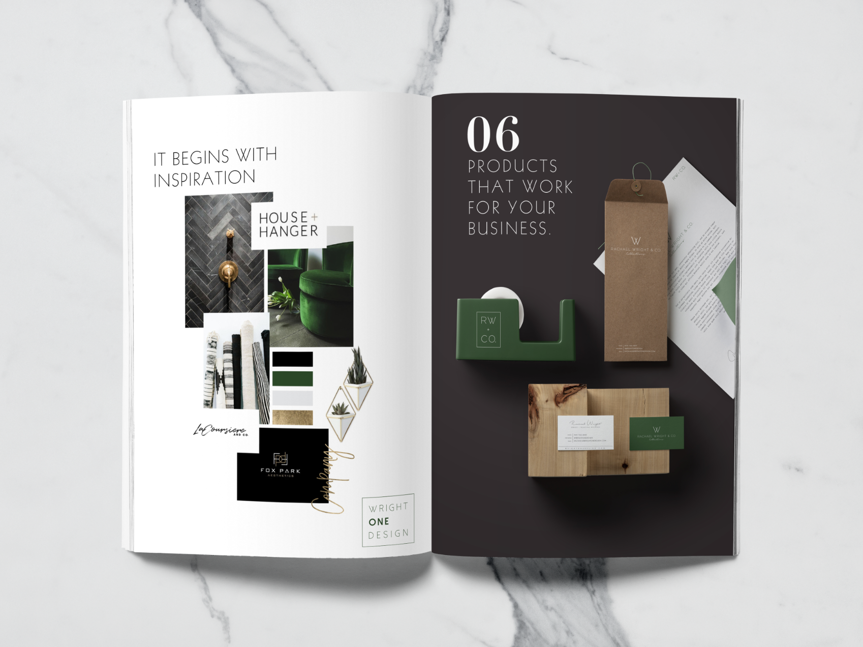
I love doing sister companies because I get to design an all encompasing vision of what could become a huge intuitive brand. Wright One Design is an interior design firm on the rise with great style and a fun modern twist to everything. Her product company, Rachael Wright and Co. is where her designer collection…
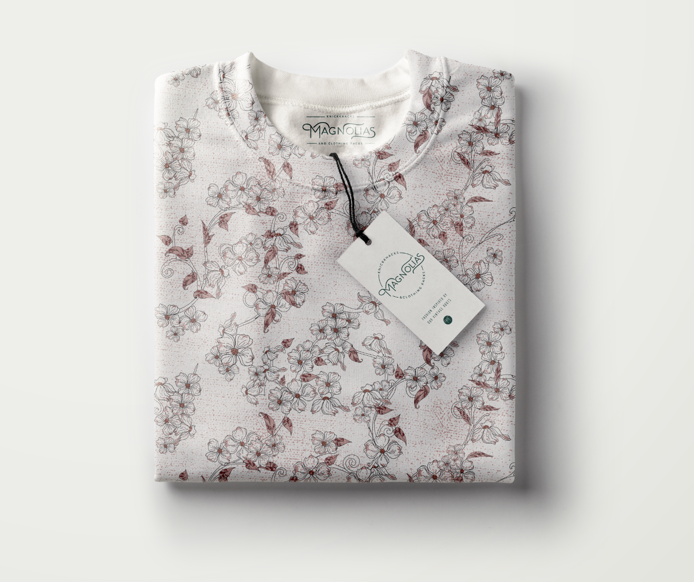
This post literally could go on forever. I LOVED doing this project because it was vintage and the color palette was so fun. Doing vintage allowed me to try lots of unique fonts and color mixtures with the added bonus of an aged texture. The client ended up with the custom lettering in a circle…
When I begin designing for a new client I am high on life. I seriously get so excited because the possibilites of creativy are endless. We start with a moodboard to help me hone in my big ideas and then I go for it. This brand was one where I really got to use my…
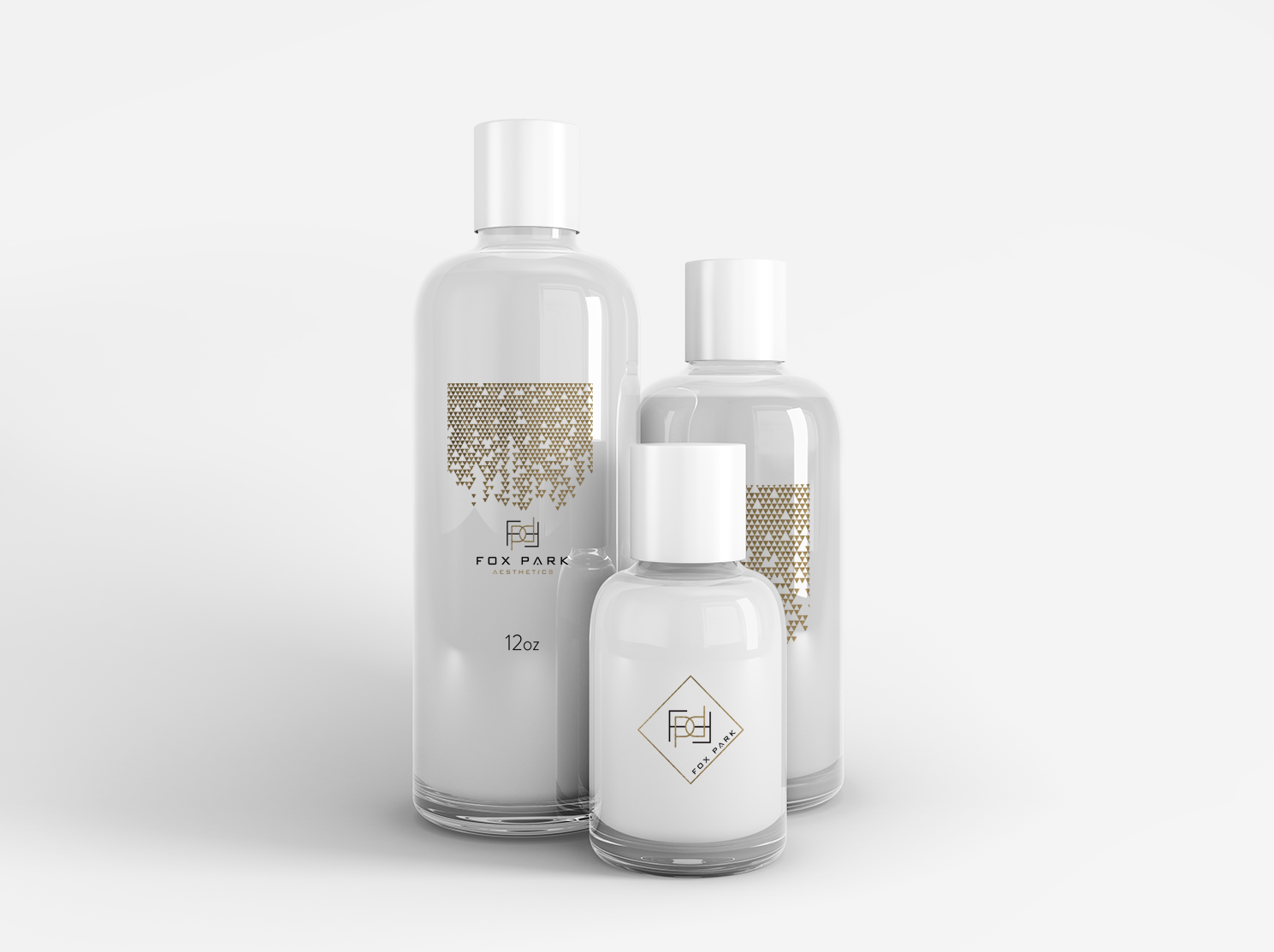
Designing this modern aesthetics company branding was really interesting for me. My client had a font in mind that I hadn’t really considered for the project and I really had to get to know it and how to use it to make the logo mark we ended with. I actually really like how it…
This project was reaallly cool to work on because it was two sister companies with the same mood board. One was more lifestyle and flowy and the other was modern product photography. I put both options images in this post so you could see all the variations we did. I LOVE VARIATIONS. My favourite…
