Not only is this girl absolutely beautiful, but she is talented and has the best style. I loved working on this design because I used a color palette that was so soft and summery. We used details like the sunset/sunrise and the custom typography to get the final look we wanted and I couldn’t be…
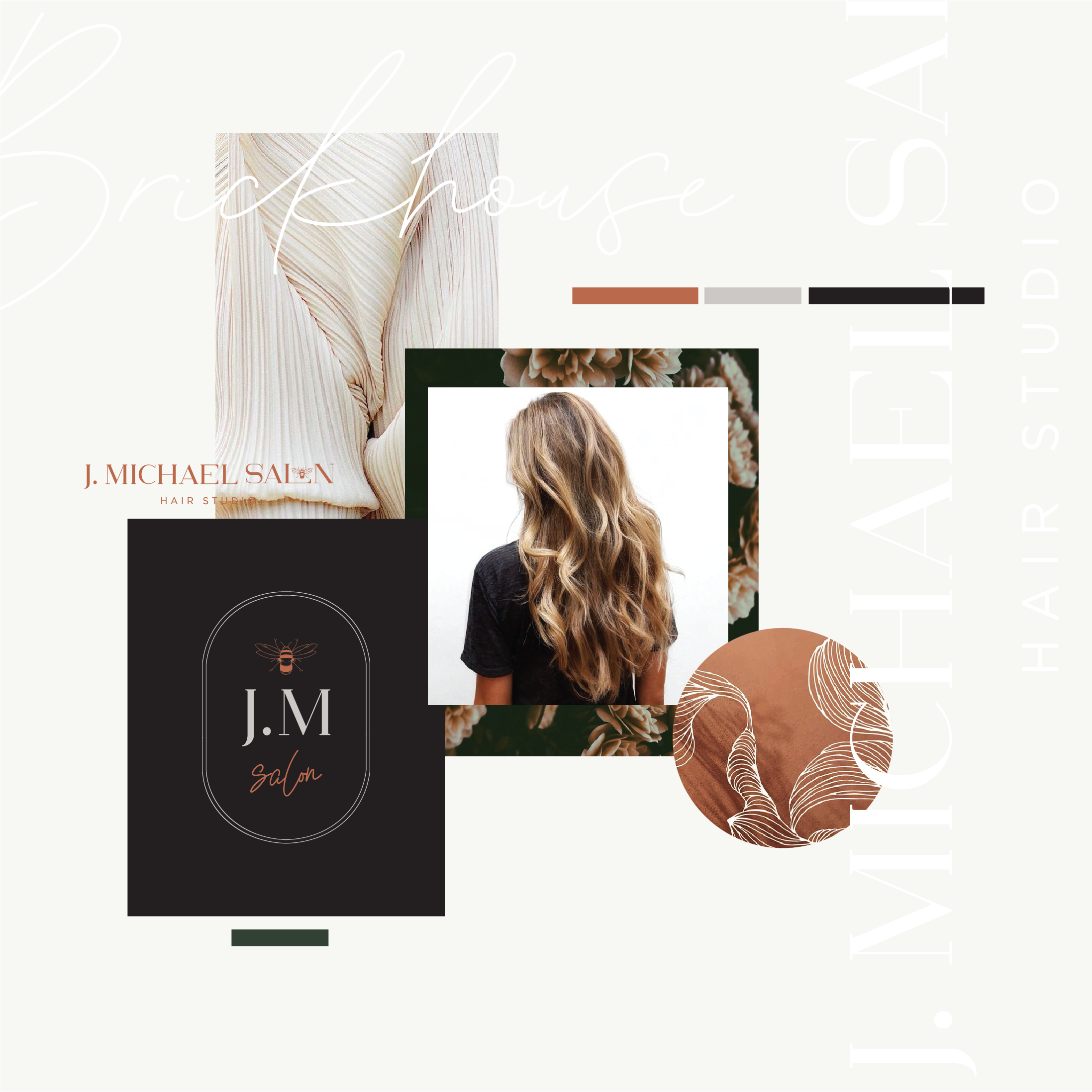
I have loved working on all of the amazing projects this year. I’ve had quite a few hair salons which has been fun considering I was thinking of going to hair school before I finalized on graphic design. Hair can be such a transformation on people and I think it is such a creative outlet…
Obsessed with this beautiful font! ZEFANI MEGANTE HESLEY
Some other fun options I came up with that didn’t quite make the cut but I still loved them! Branding for Salt and Light hair was so much fun because it was in allignment with my own style right now. When a client and a designer are a perfect match magic happens and everything about…
I can’t even begin to tell you how much fun working on this project was. It was my first job back from maternity leave and I really needed a creative outlet after three months away from design. This brand has an organic travel vibe that is so soothing and comfortable. We wanted something unique but…
I had the chance to work on a couple family projects this year and Acaby Rose was one of them. It is a womens clothing line that has had so much time and care put into its products. I am really excited to see the final product. They requested a really simple, clean font style…
This is probably my favourite branding project of the year so far. I LOVE flowers and the mix between modern and vintage and I feel like we reached a really good place with this logo. Who doesn’t love seeing options right?! I always love putting all the options in my branding posts because I love…
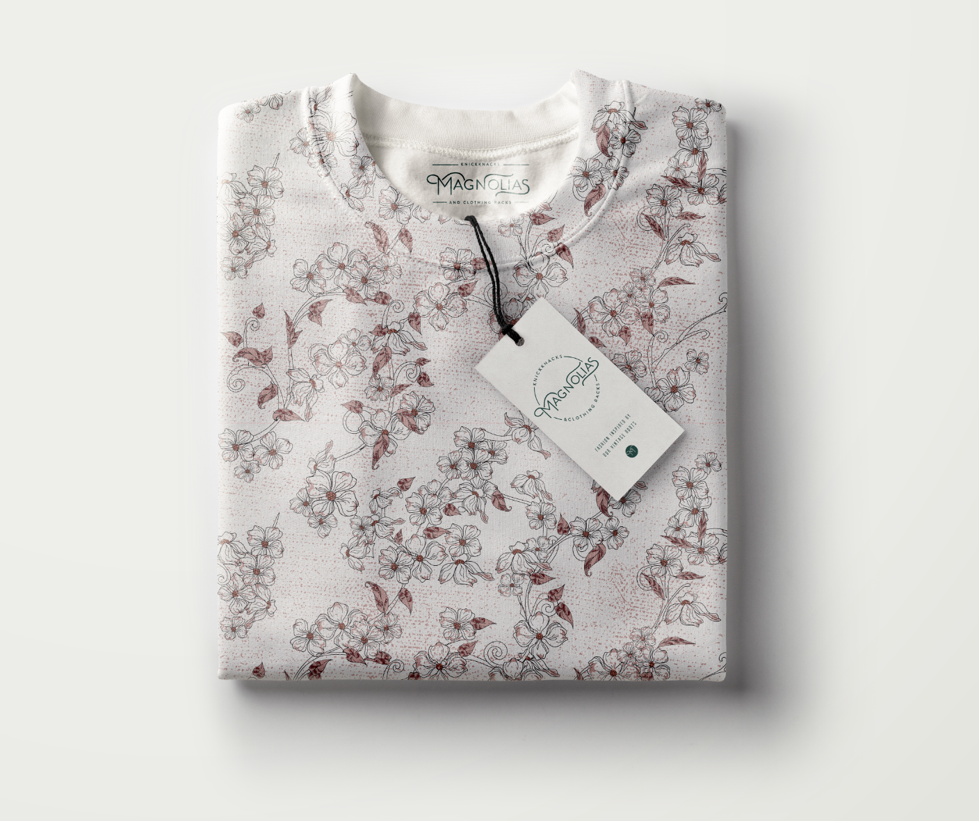
This post literally could go on forever. I LOVED doing this project because it was vintage and the color palette was so fun. Doing vintage allowed me to try lots of unique fonts and color mixtures with the added bonus of an aged texture. The client ended up with the custom lettering in a circle…
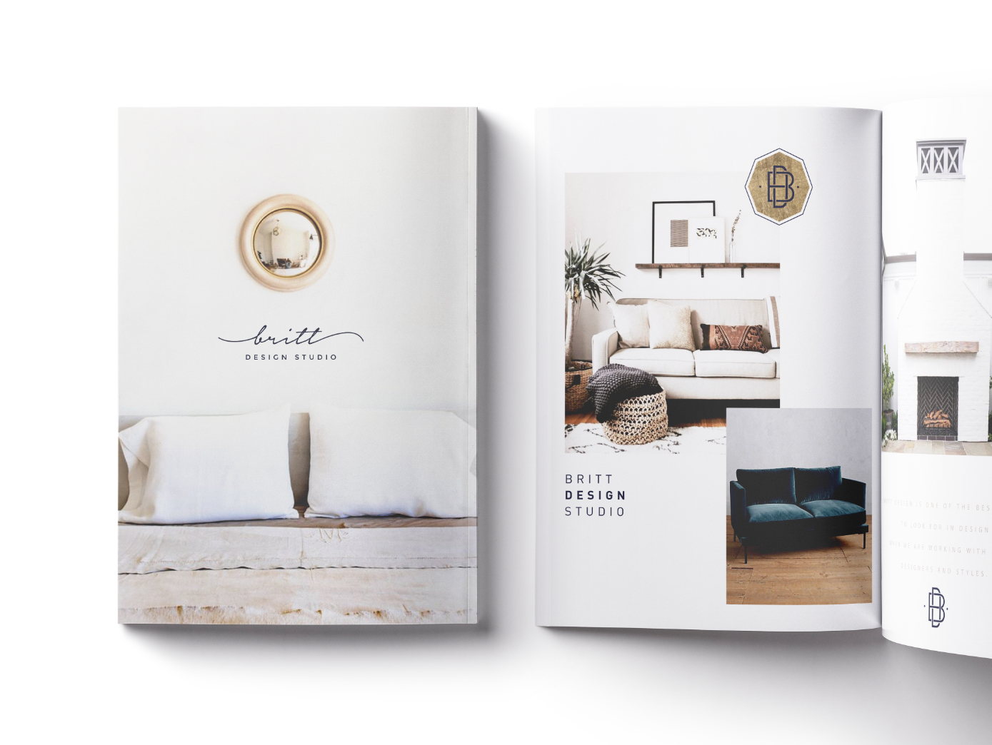
This branding project was for a interior design studio in NYC. She was very specific (which helps me a ton), with what she wanted so I feel like we came to a great final solution for her and her brand. She had a color palette in mind and wanted to keep the brand very classic and simple…
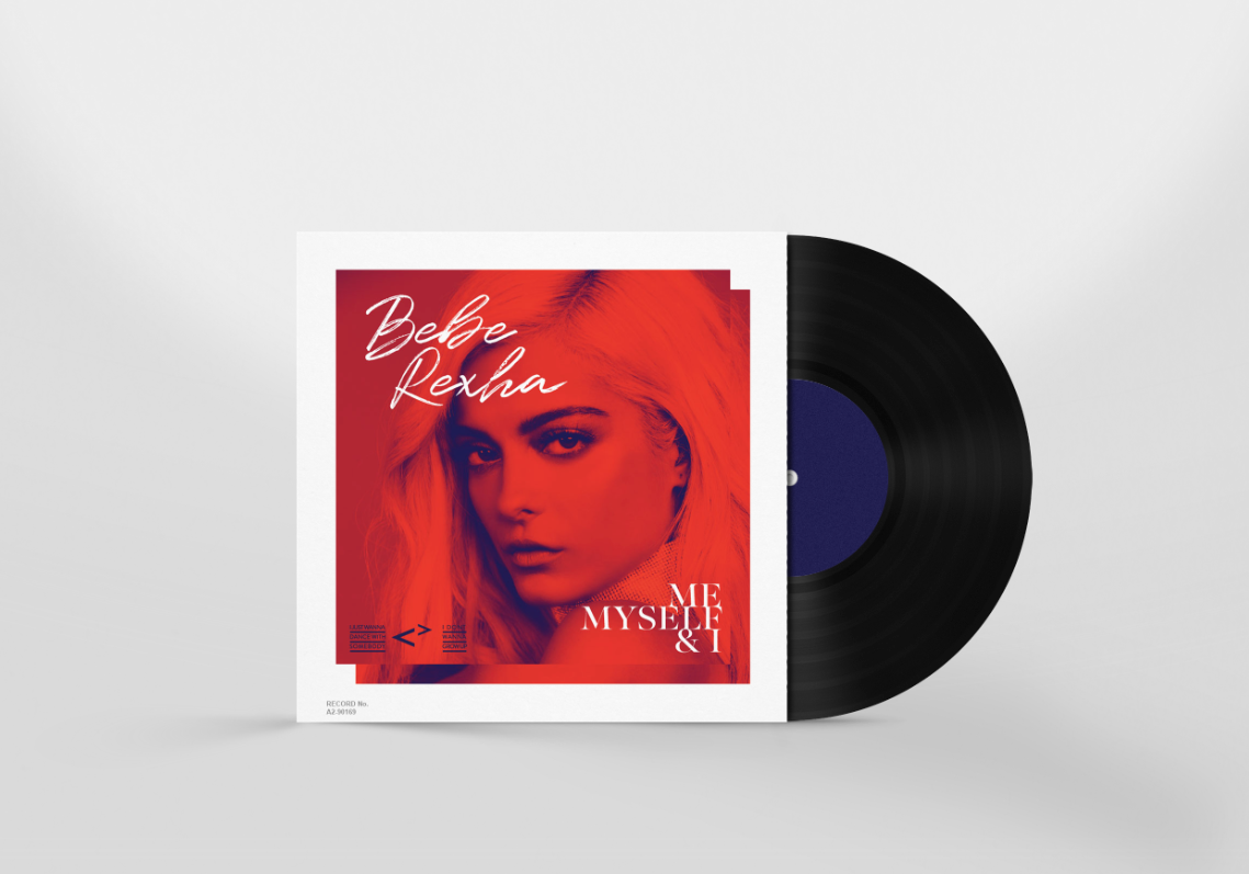
I really loved working on my MPP last year because it gave me the freedom to try new styles and do whatever I wanted with the music that inspires me. I decided to pick it up again and do a few this year. I love this woman’s music and everything she is about, fun, good…
