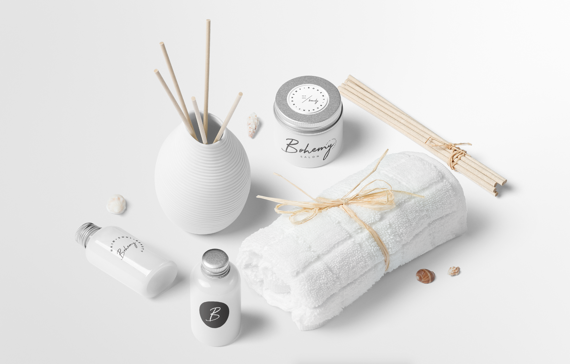
Bohemy is a beachy bohemian styled salon with a fun edge located in Florida. The client wanted a really modern but relaxed feel to the overall branding keeping it simple with the color palette only adding pops of mint and dusty blue. I love what we ended up with and I think it was…
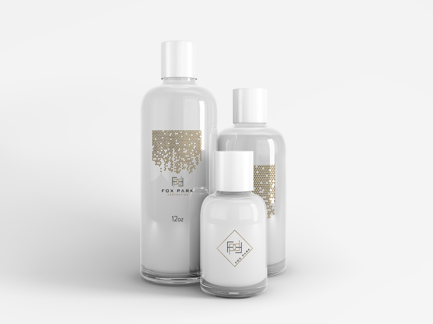
Designing this modern aesthetics company branding was really interesting for me. My client had a font in mind that I hadn’t really considered for the project and I really had to get to know it and how to use it to make the logo mark we ended with. I actually really like how it…
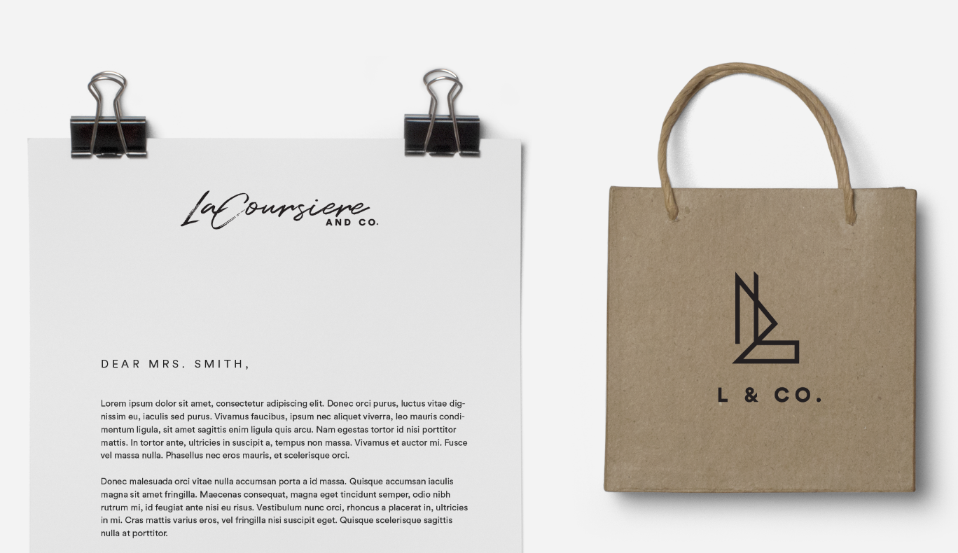
This project was reaallly cool to work on because it was two sister companies with the same mood board. One was more lifestyle and flowy and the other was modern product photography. I put both options images in this post so you could see all the variations we did. I LOVE VARIATIONS. My favourite…
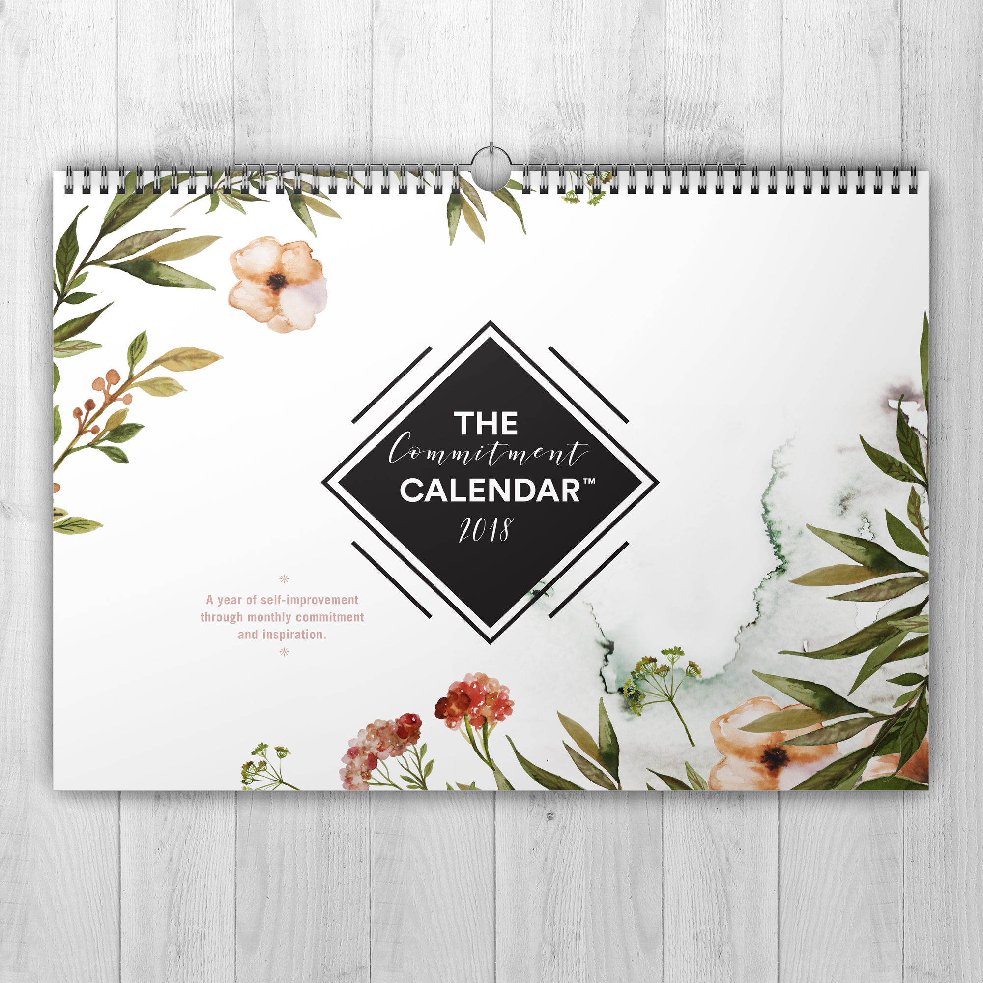
We also did some fun downloadable prints from the artwork in the calendar for only $10! A friend of mine, Second Ammendment Mommy came to me about this business idea and I was like, meh, sure. I needed a calendar and thought whynot design my own. Once we designed it, I was like heck yes!!!…
I have been HORRIBLE at posting recently. I honestly looked in my drafts box and saw all of these half done posts that I thought I posted so I am really going to try and go crazy this next month and get caught up. That being said, my favourite post is this one because it…
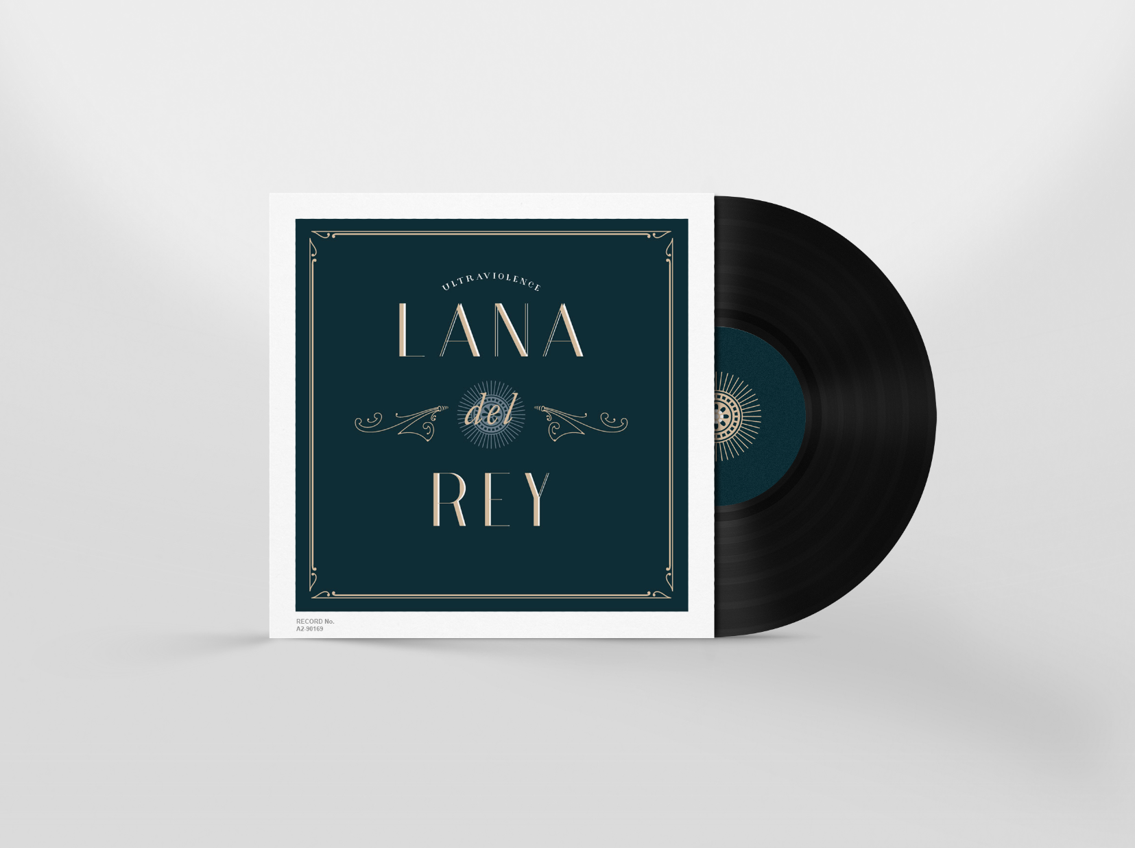
It’s bout’ time I do a Lana Del Rey poster up in hurr. I have been obsessed with her over the last five years and have finally decided on a design that fit some of my favourite songs of hers. When I first heard her, she was the epitome of old hollywood glam. This last…
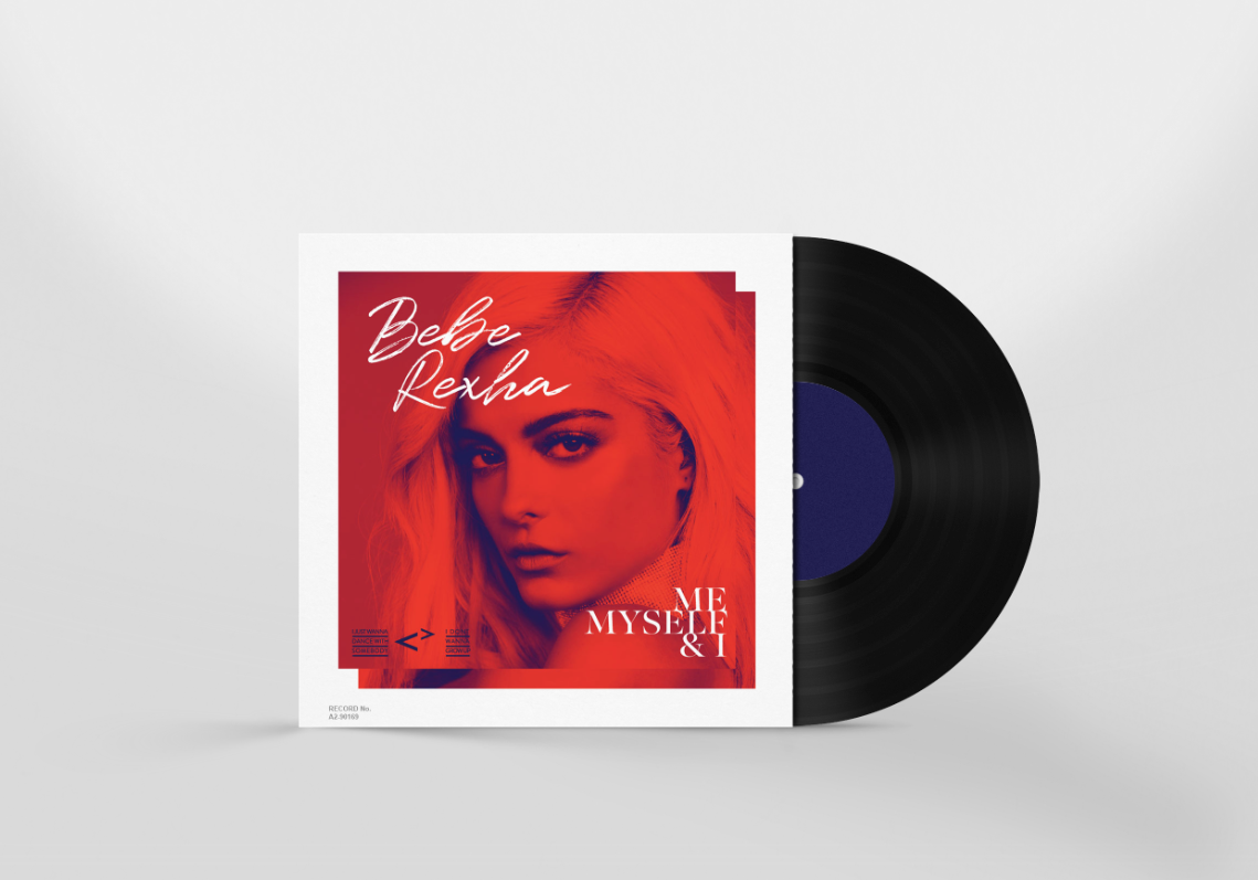
I really loved working on my MPP last year because it gave me the freedom to try new styles and do whatever I wanted with the music that inspires me. I decided to pick it up again and do a few this year. I love this woman’s music and everything she is about, fun, good…
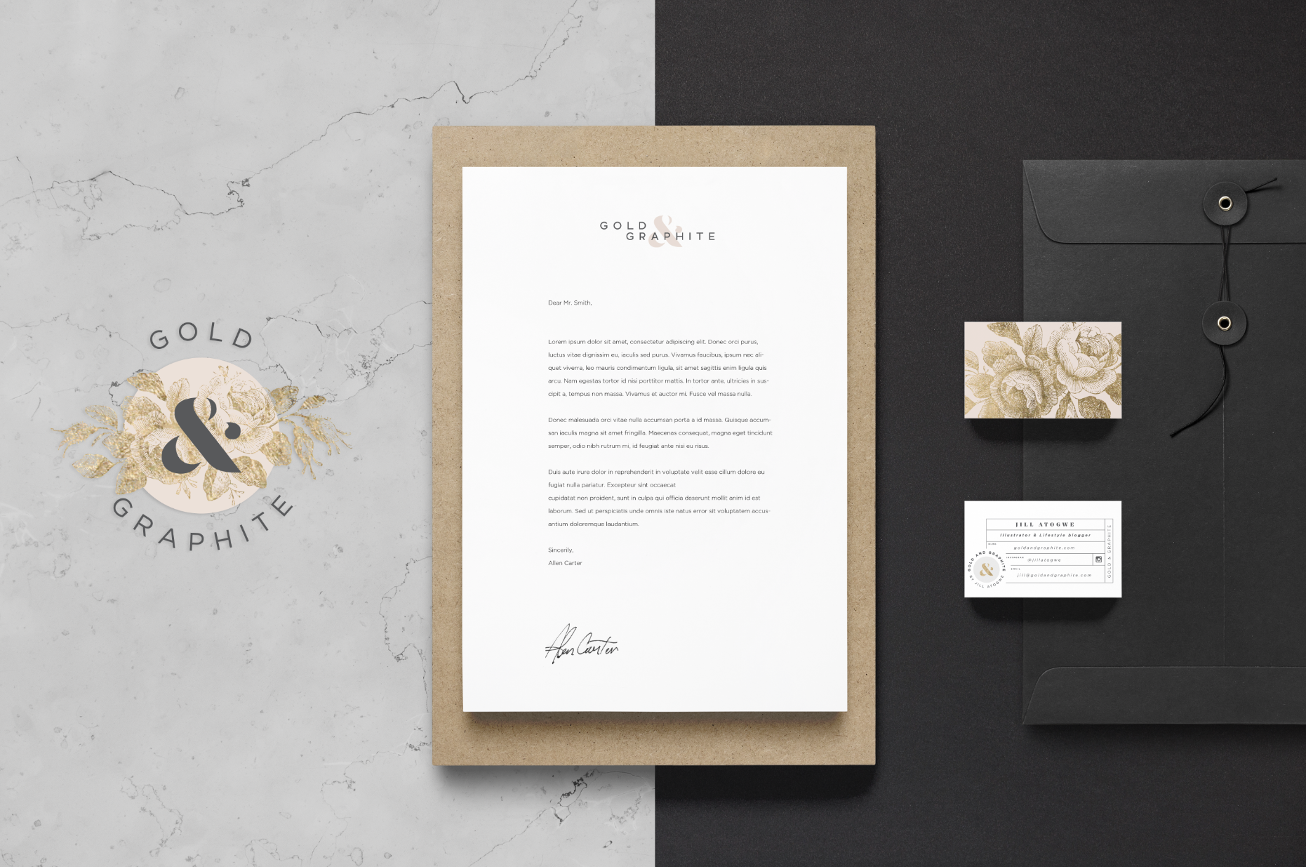
I love to put the logo options in my post because its so fun to see how the logo evolves as well as the different directions someone can go with the same overall idea. This project was so much fun to work on. I was inspired by Jill and her amazing blog and saw the…
FINAL CHOSE OPTION THE RUNNER UPThis is a fun new company I got to work with on their branding. They came to me with a color palette and an overall idea of what they wanted to look like and with some refining and a clear vision, we came up with the perfect branding package for…
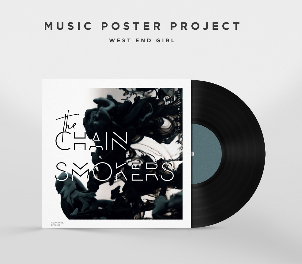
Jammin in the car with the music up loud is the memory I have when I hear their music. The chainsmokers came out with THE PERFECT SONG for cruisin and so of course I had to honour them by designing some fan art for my final Music Poster Project of 2016. The typography on this…
