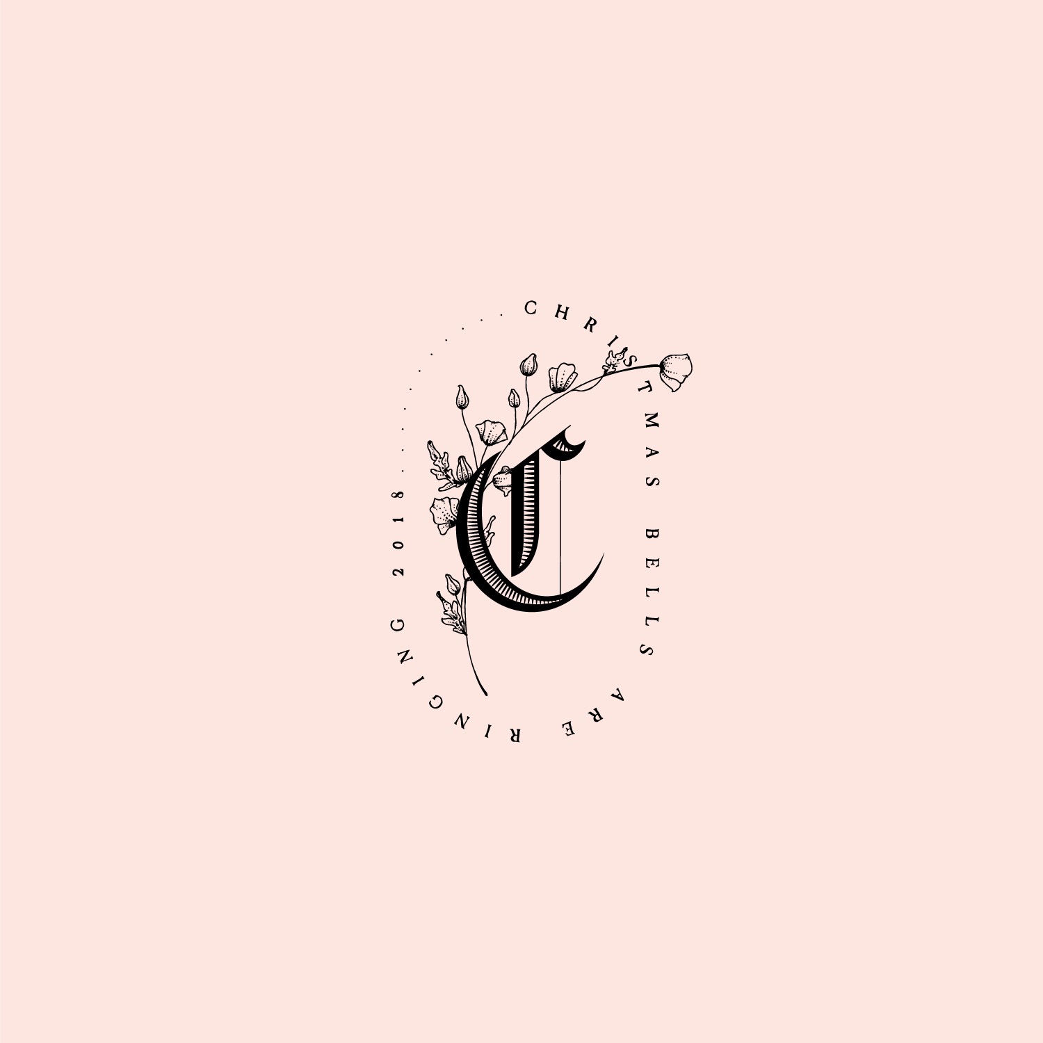
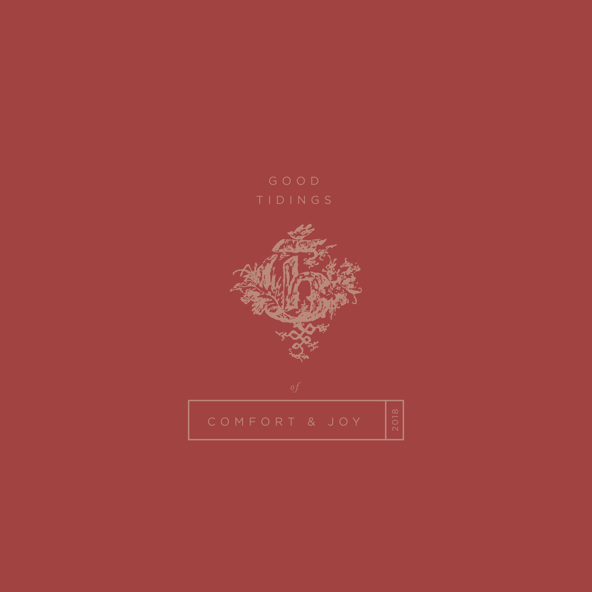
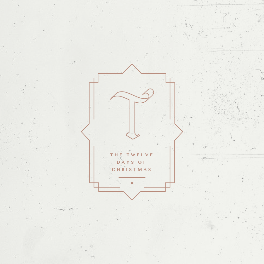
 This one ended up looking Harry Potterish but I’m not going to complain.
Here is the logo mock-up I did to show how these fonts can be used.
I always like giving myself a new challenge, and this one was no different. I have always loved the intricate details of medieval inspired fonts but most of them look like graffiti art or really tacky in general when used. I wanted to use them as drop caps and then mix them with cool layouts and modern fonts paired with Christmas phrases. I had a lot of fun and really want to incorporate them into a branding project (if my client will let me). I did a mock-up logo to show how it can be used and look unique and classy. To see them on instagram use tag #medievalfontchallenge
Feel free to save these and use them on social, print them or do whatever you want with them!
