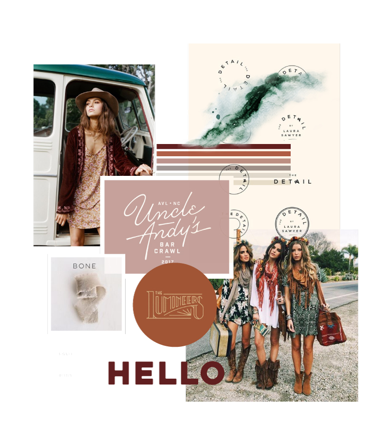
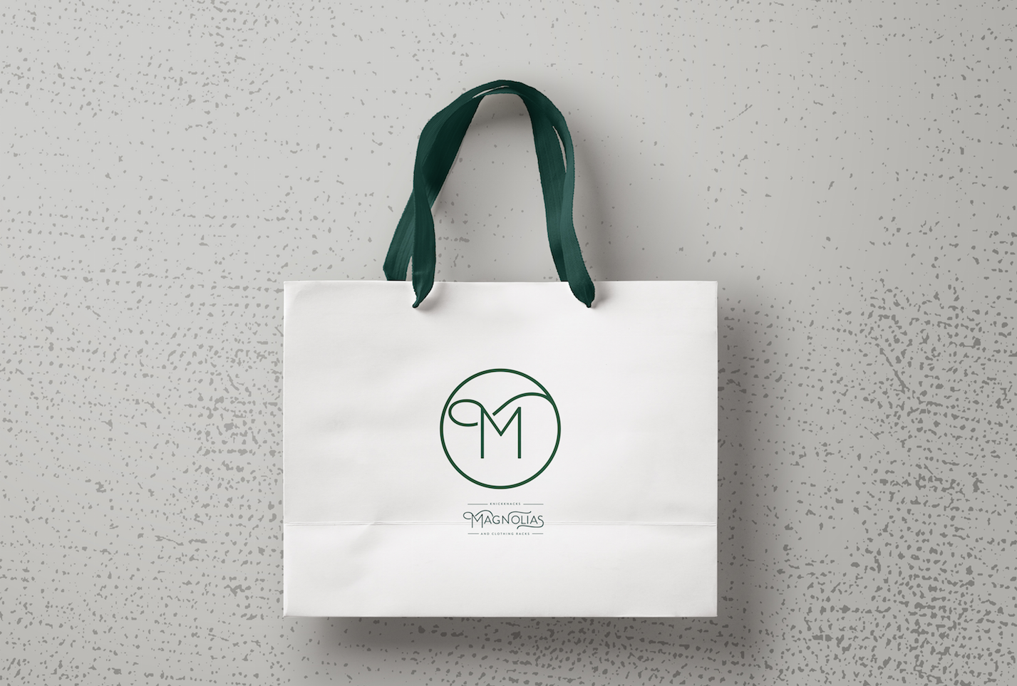
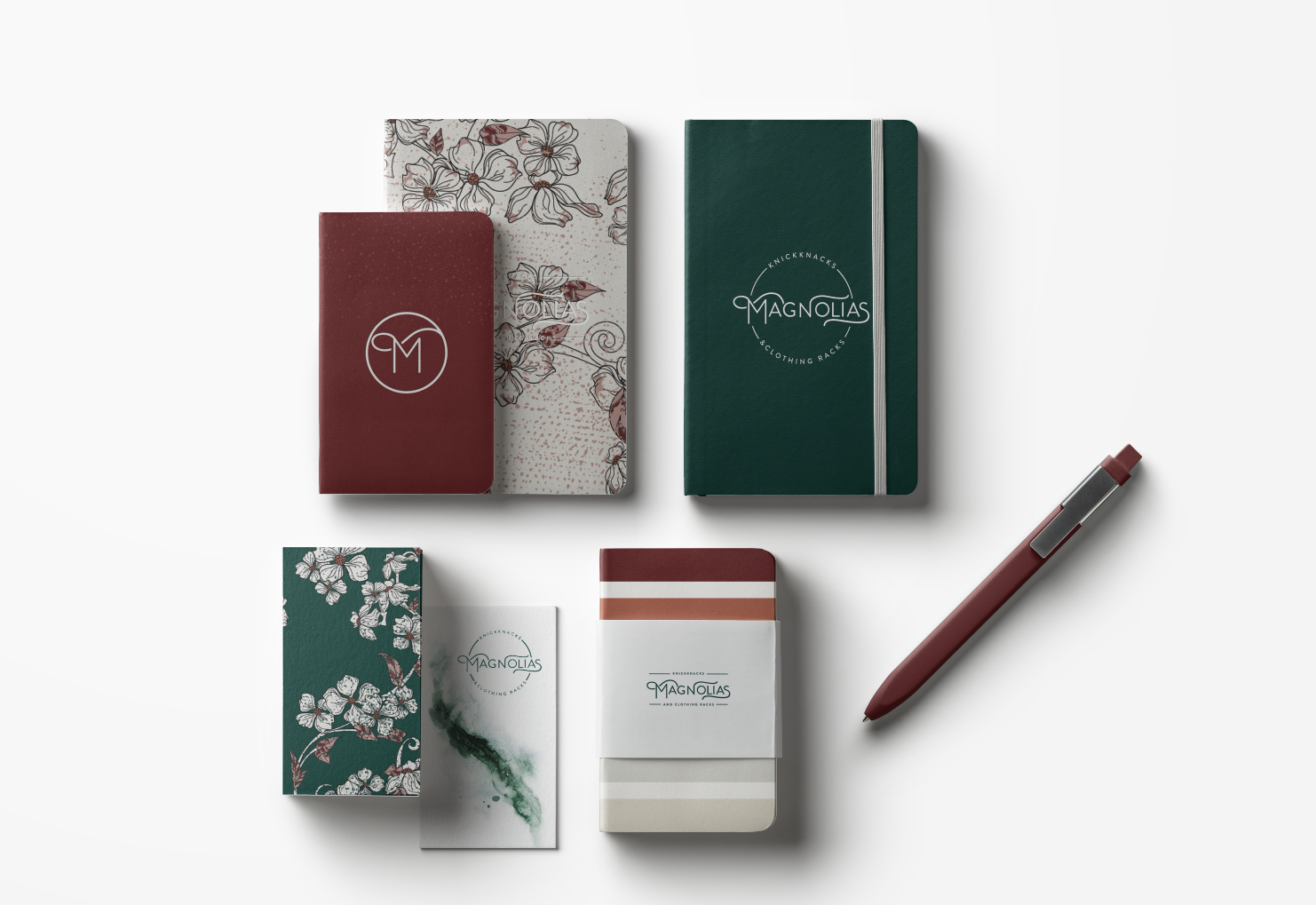
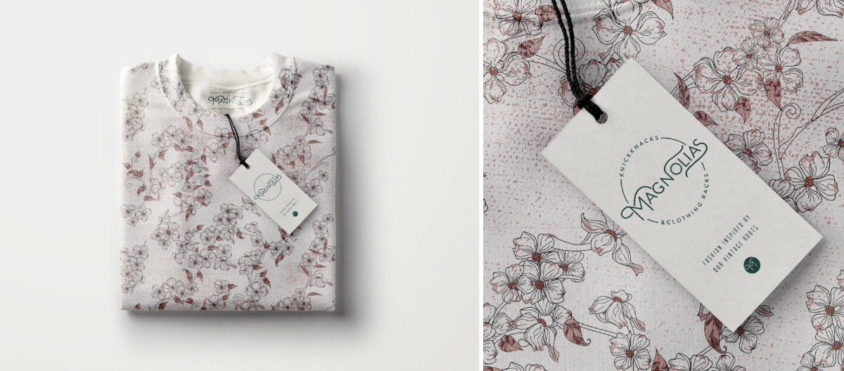
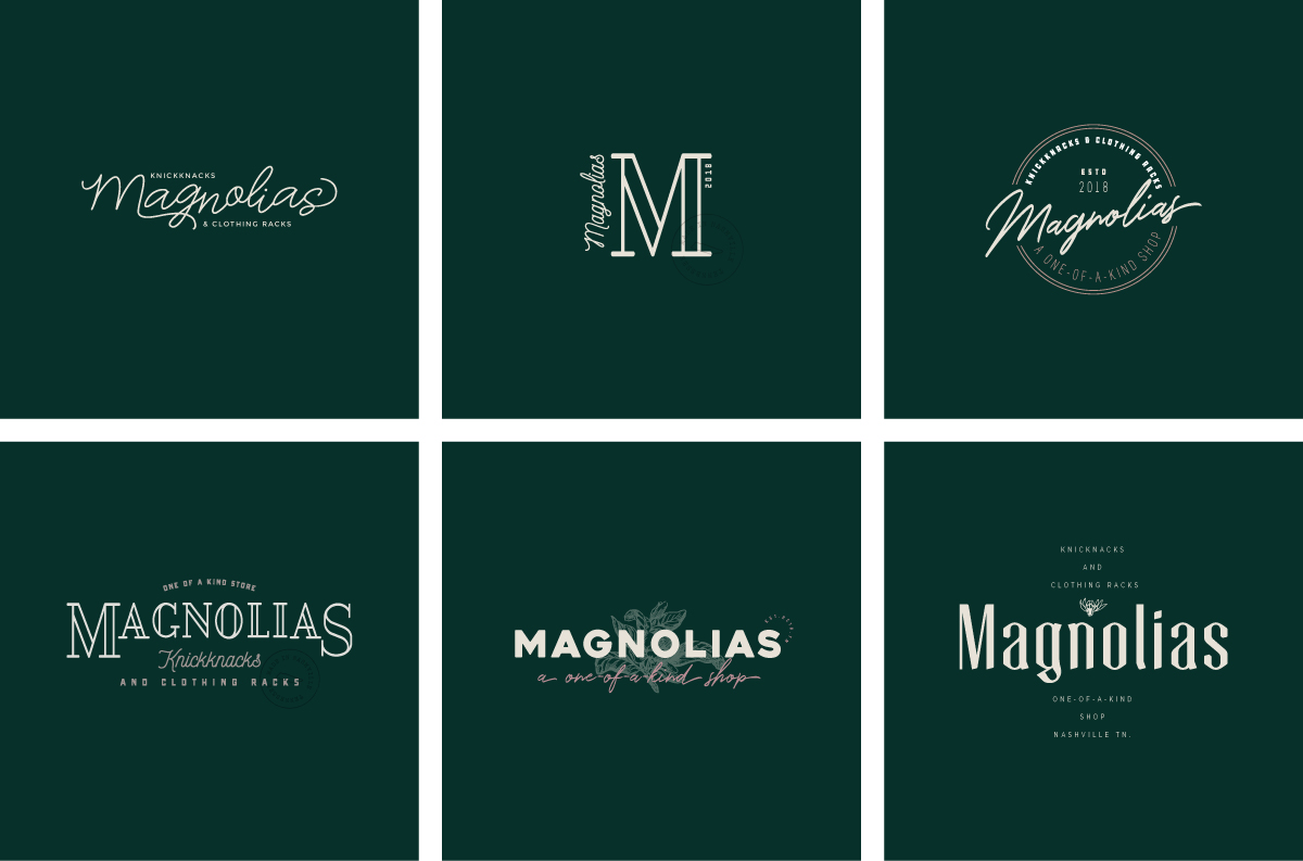


 This post literally could go on forever. I LOVED doing this project because it was vintage and the color palette was so fun. Doing vintage allowed me to try lots of unique fonts and color mixtures with the added bonus of an aged texture. The client ended up with the custom lettering in a circle emblem. Because I loved sooooo many options in here, I made mockup for some of them so you could Pin them if you would like.
