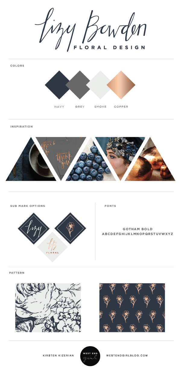
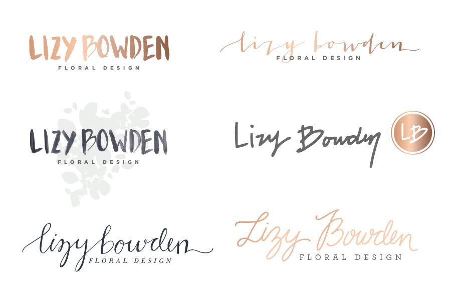
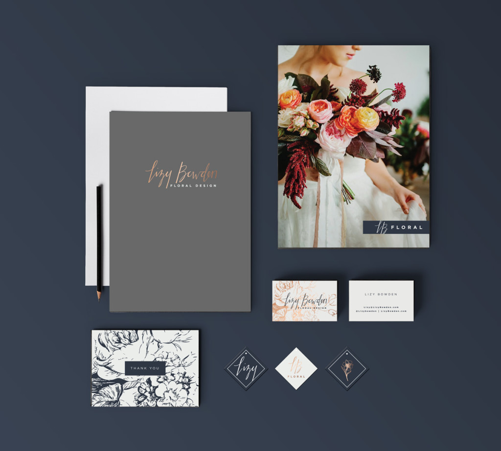
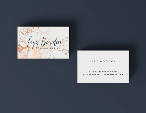
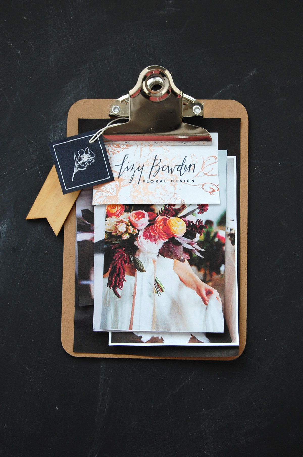
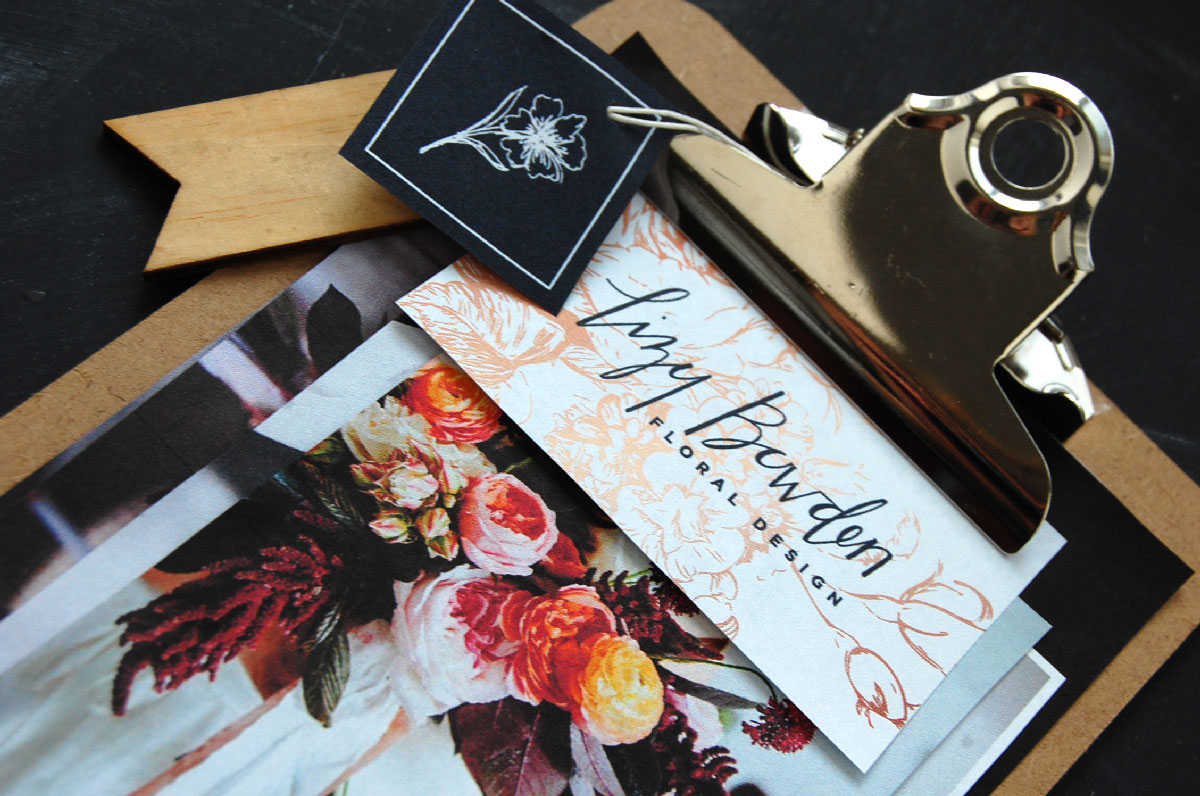
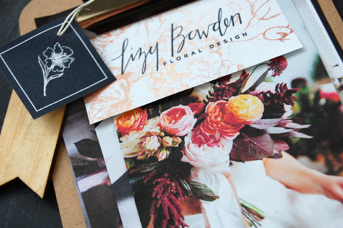
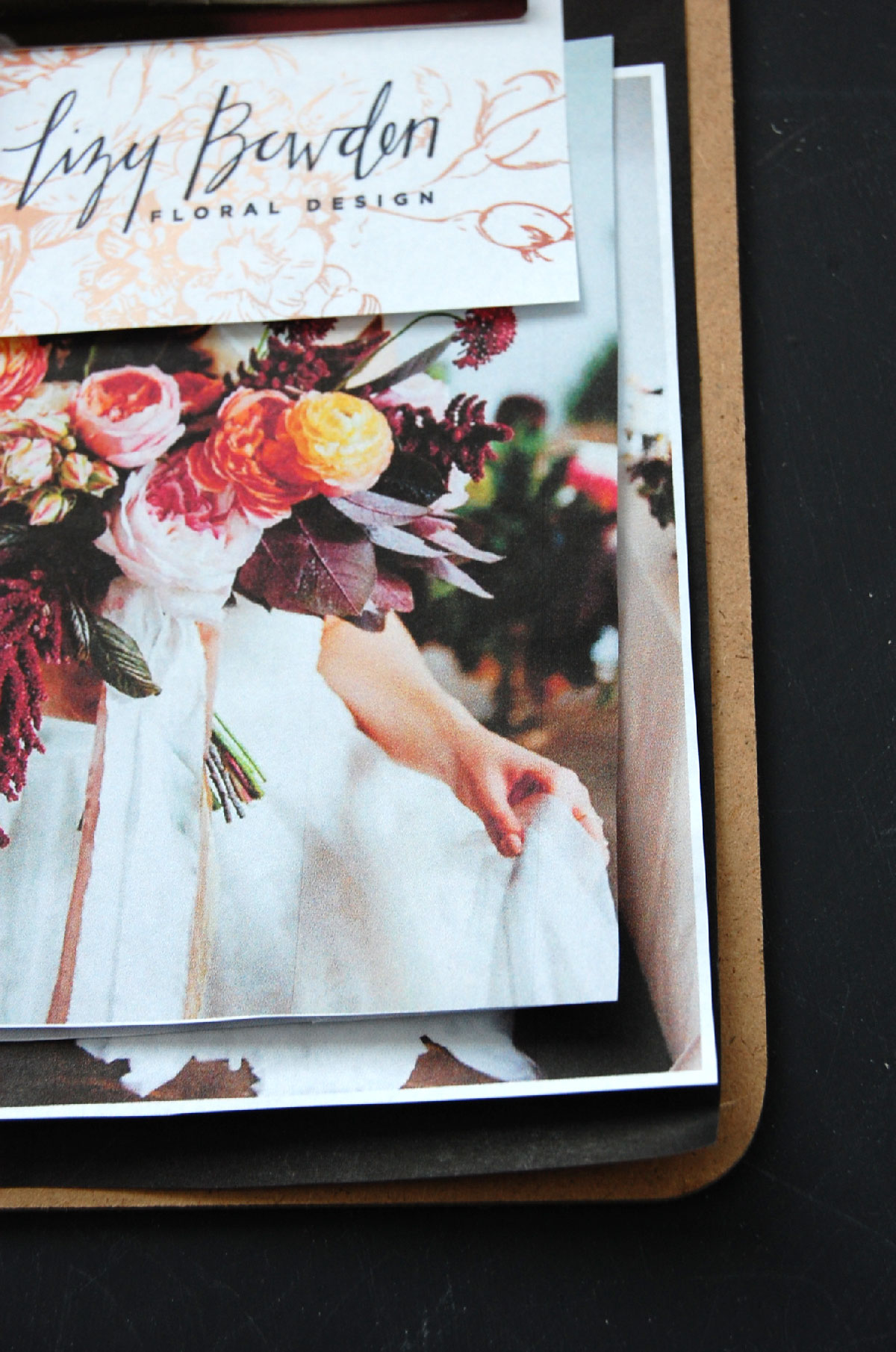
This was probably the hardest branding job I have ever done. It was not because of the client, because she was amazing to work with and very creative. I think I just couldn’t quite hit the perfect mix of wedding and edge to make the right logo. We went through a ton of good ones but when we finally got to the last one, I knew it was finally what she wanted. Lizy is a florist who does very elegant and high end weddings. However, her personal style is a bit more edgy and mixing the two really pushed my design skills. I love when this happens because it makes me learn something new. I had to get off the computer and sketch and learn calligraphy as well as perfect my lettering skills. It was so much fun and I am grateful for this project. The color palette is beautiful and moody and brings in a modern element with the copper details. She is just a classy girl, what can say!
Bride & bouquet photography: Whitney Hunt Photography
MUSIC INSPIRATION: Through the dark ~ The Mowgli’s
