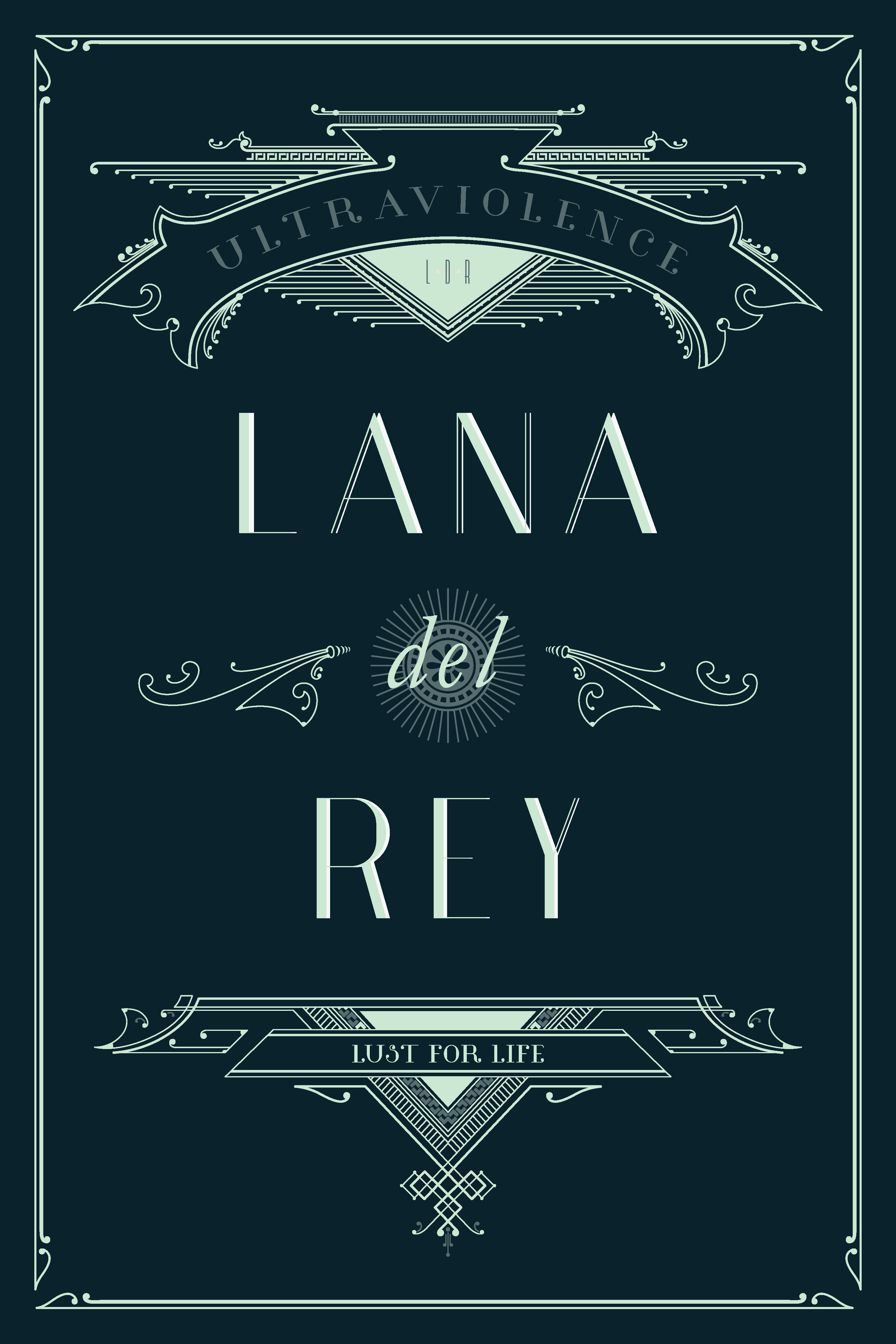
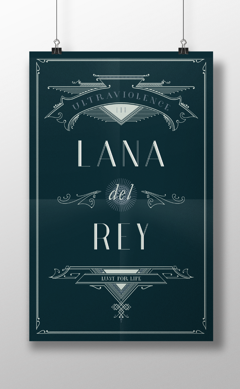
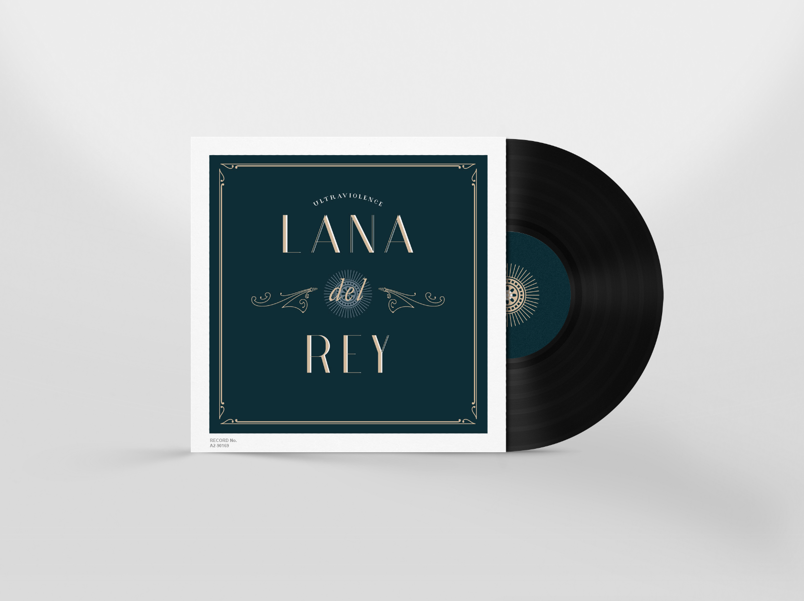
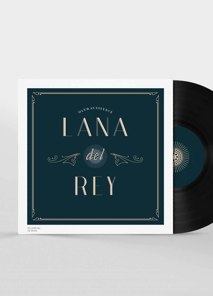
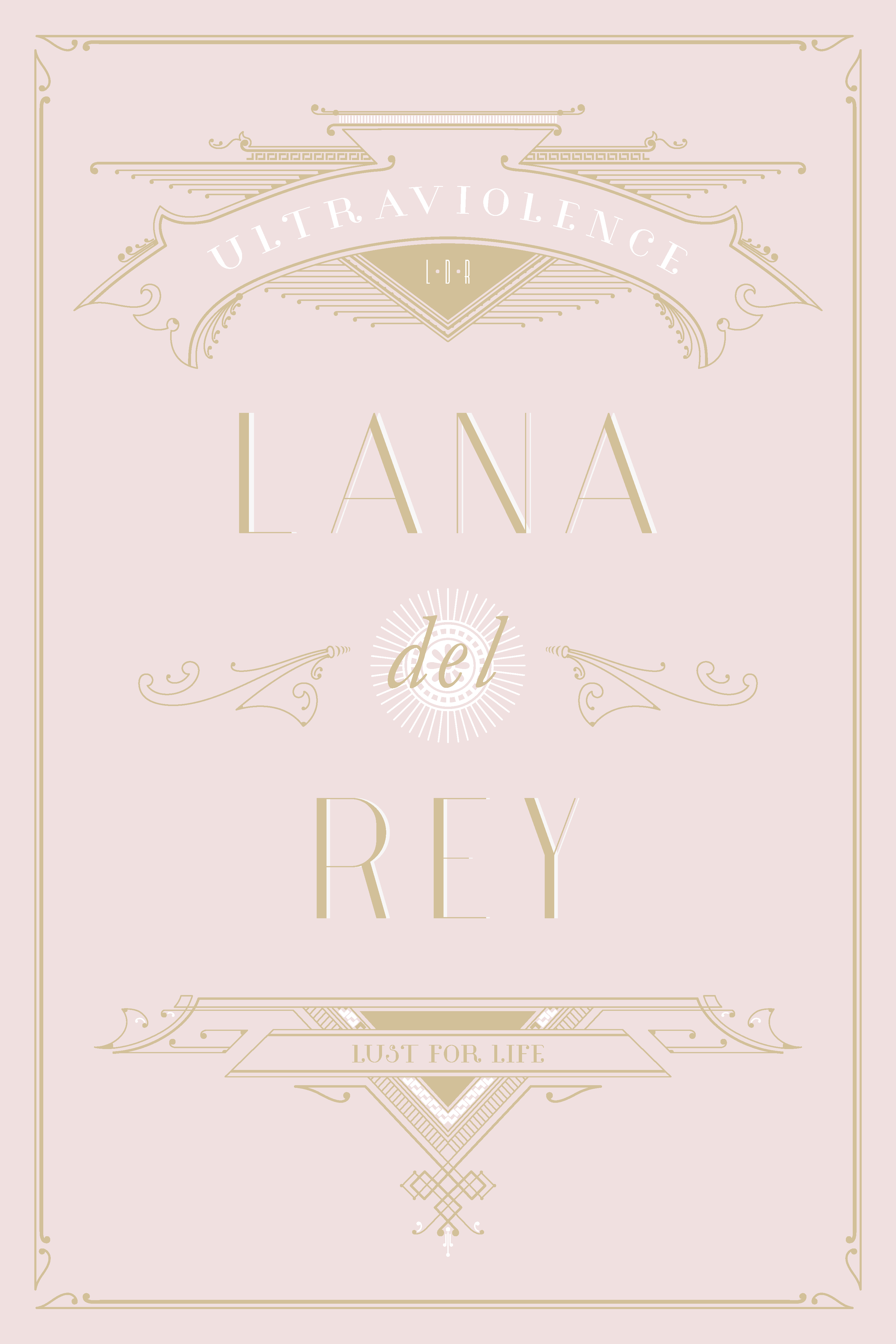
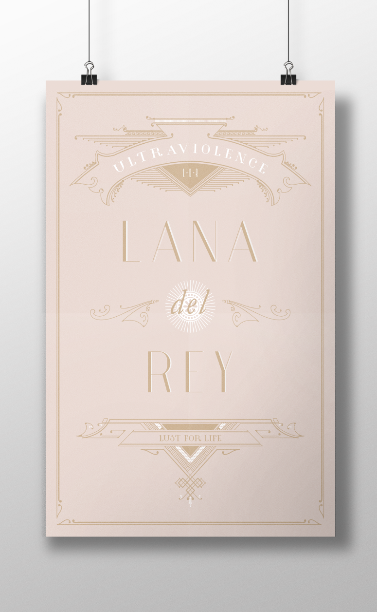
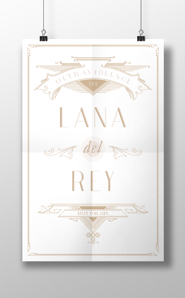
 It’s bout’ time I do a Lana Del Rey poster up in hurr. I have been obsessed with her over the last five years and have finally decided on a design that fit some of my favourite songs of hers. When I first heard her, she was the epitome of old hollywood glam. This last weekend I had the chance to go see downtown hollywood and the walk of fame. It was beyond ghetto in most areas but I saw the potential of its old glory in small things like the stars, architecture and some of the cool street art.
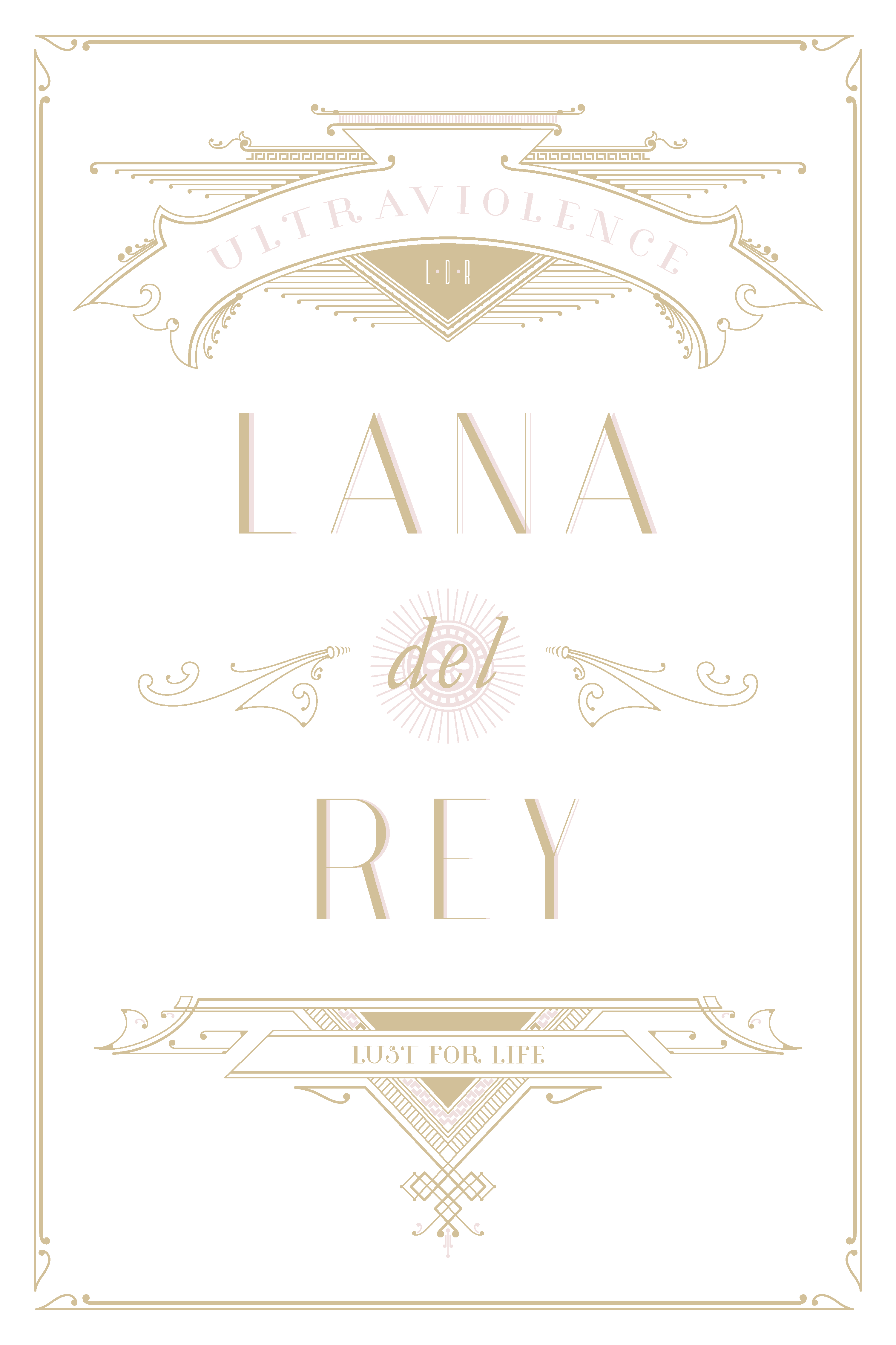
I wanted this poster to be in its glory days, when the city was built and thus I used every art deco font possible. The color palette was really fun too. Some of her songs are soft and melancholy and some are dark and moody so I had to do a few different palettes. Check out the rest of my poster designs HERE.
