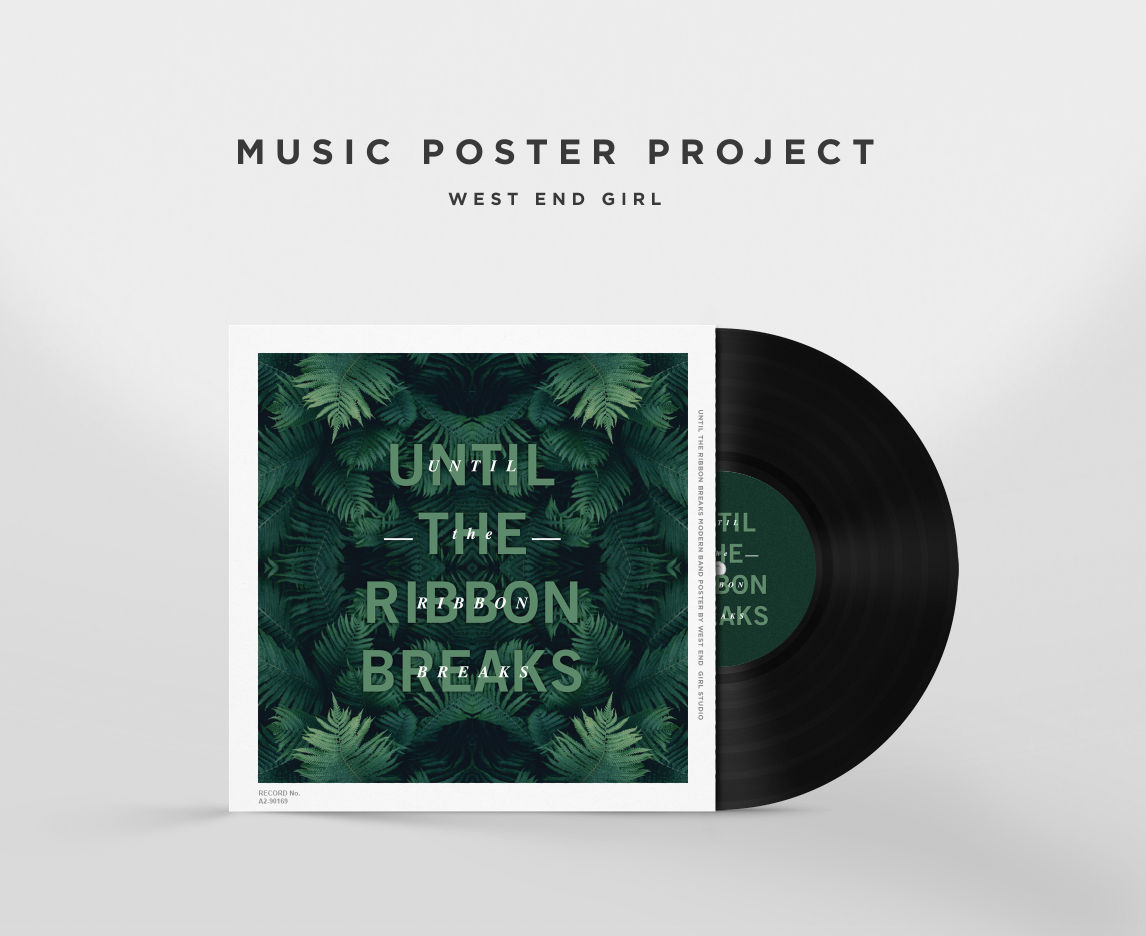
I have loved this band for a very long time. They aren’t widely known but I feel like they should be because of their cool sound that gets me so pumped when I design.
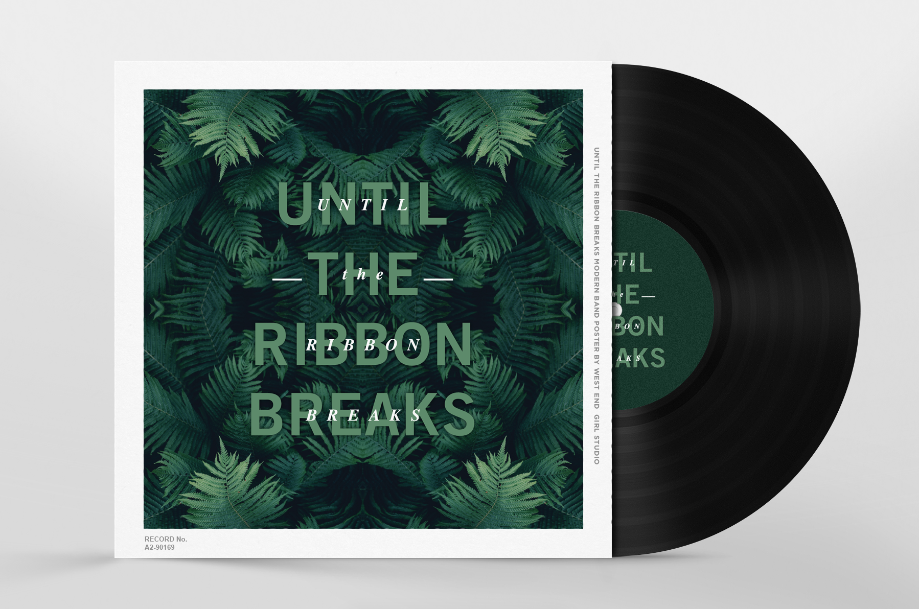
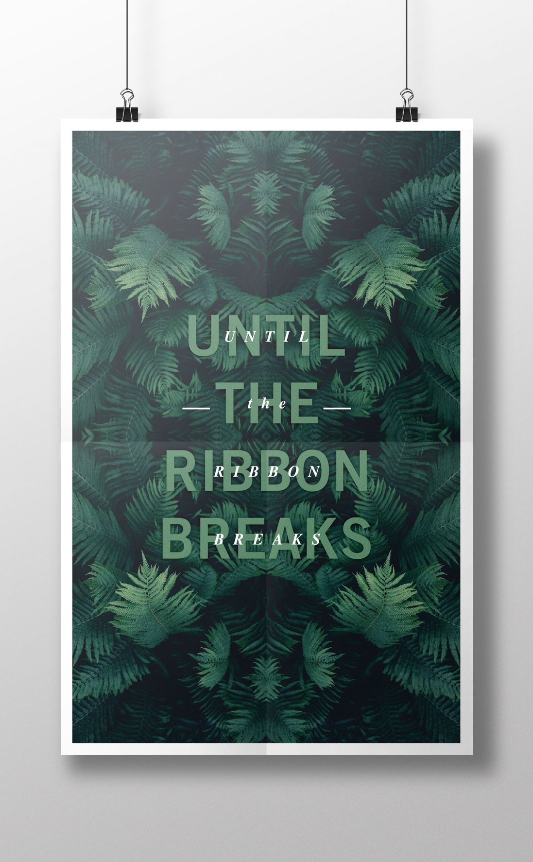
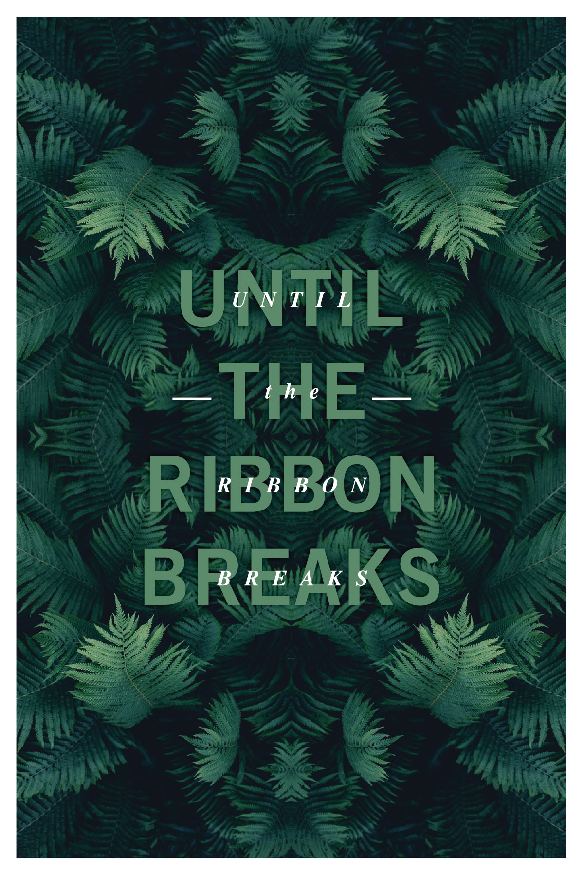
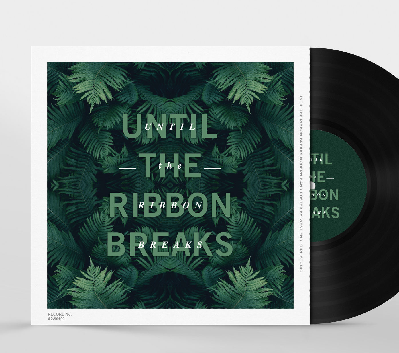
I pictured a clean font for this poster before I thought of anything else. Since they are very modern but also very smooth I felt like they needed a deep moody color palette to work with. I love green, (I painted my master bedroom accent wall this color green) so I looked for an image that I could spice up and do the kaleidoscope effect to. I love pairing really complex artwork with really simple type, I think it adds an awesome balance to everything for a final product. If you get some time and you like unique music, you should check out my recommended songs below.
Ciao,
Kirsten
UNTIL THE RIBBON BREAKS
One Way or Another (cover) | Romeo | Pressure | Revolution Indifference (my fav right now)
